import pandas as pd
import matplotlib.pyplot as plt
import numpy as np
import scipy.stats as statsGetting started with data analysis
Background to this example
Data comes in all sorts and forms within Earth sciences, from long term paleo records describing Oxygen levels in the atmosphere, timeseries of river discharge and spatio-temporal satellite images monitoring the vegetation. Within Earth Sciences we work with all these types of data to understand the past, present and future of the Earth system. Before we can work with these types of data we need to understand what we can and cannot do with the data, which conclusion we can and cannot draw. Test In this practical you will learn about
Explore data
Test for normal distributions
Look for trends
Use hypothesis testing
Calculate climatology and seasonal cycles of datasets
Getting started
Let’s start with using Python again by opening your Conda environment and then opening Spyder (for detailed instructions please look back at the first practical). We start by loading some of the stand libraries in this course. We use:
Pandas (data management and data handling)
Numpy (statistical analysis and data handling)
Matplotlib (plotting)
Scipy (statistical analysis)
Set the Working Directory
In Python you have to let the script know where to find the data that you want to use. This can be done using two ways, either by specifying relative filepaths or absolute filepaths.
In Spyder, the working directory is shown at the top right of the window under files. In this place you can navigate to your working directory. All relative paths are based on this directory.
You can also set it programmatically:
import os
os.chdir("your/desired/path")
print(os.getcwd())
An absolute path points to a file from the root of the filesystem and works regardless of the script’s location.
# macOS / Linux
file_path = "/Users/yourname/Documents/data/file.csv"

# Windows
file_path = "C:/Users/yourname/Documents/data/file.csv"
The advantage of relative file paths is that if you move the folder in which you are working, all relative path stay the same and don’t need changing. The advantage of an absolute path is that it is easier to navigate if the data is in a completely different location or far outside of the working directory.
In general you should aim to use relative paths as the chance of making mistakes is reduced when moving data between computers or on your system.
In the working directory for example UU/Data2/ you create a folder Data, this folder can contain all the .csv and other input files. For detailed instructions on downloading all necessary input data, please refer to the installation instructions.
Also create another folder with all called Scripts this folder can contain all the practicals. You can name them Week01.py, Week02.py etc. This way you can always run them an understand as well as find them back.
Running the Python code and making your script file
When you do the practical we want you to make a script file that contains all the code that you have created. To this end we will make use of a script file which is typically called something like Week01.py or Week02.py etc. These script files should contain all necessary code to reproduce your figures and findings. For example:
import pandas as pd
import matplotlib.pyplot as plt
import numpy as np
import scipy.stats as stats
import os

## Change to working dir
os.chdir("your/desired/path")

## Question 1
np.random.seed(1)
randomData_1 = np.random.normal(loc=0, scale=1, size=100)
randomData_2 = np.random.normal(loc=0, scale=1, size=100)
## Answer 1
## I think this is because x, y, z
....
....
....
You can use ## to put comments in the script or answers to the questions as is done in the example above.
If you want to run (parts of) your code you can use two options in Spyder. Either you run the entire script, however this will not print any output by default or you can run parts of your script and generate the outputs. To do this you can use these buttons in the program that can be found on the top left of the menu bar.

If you run the entire code it is recommended that you use print statements in your code as provided in the template below.
import pandas as pd
import matplotlib.pyplot as plt
import numpy as np
import scipy.stats as stats
import os

## Change to working dir
os.chdir("your/desired/path")

## Question 1
np.random.seed(1)
randomData_1 = np.random.normal(loc=0, scale=1, size=100)
randomData_2 = np.random.normal(loc=0, scale=1, size=100)
print(randomData_1)
print(randomData_2)
## Answer 1
## I think this is because x, y, z
....
....
....
This will ensure that randomData_1 and randomData_2 are printed even if you run the entire script. For efficiency reason we always recommended only the selection of code that you need to run rather than the entire script. It is expected that you hand in the .py files at the end of each week and that these files can run without errors.
Loading some data
Now we are going to take a look at the first dataset which contains information about the amount of precipitation in the Netherlands. We tell pandas to parse the date information, and use it as row labels:
precip = pd.read_csv("../Data/annualPrecipitation.csv", parse_dates=True, index_col=0)In this dataset you find the annual sum of precipitation in the last century. The data is now stored in the variable precip. You can explore the data by looking at the data within this variable with:
precip.head()| Precip | |
|---|---|
| Year | |
| 1906-01-01 | 726.3 |
| 1907-01-01 | 661.6 |
| 1908-01-01 | 644.0 |
| 1909-01-01 | 832.7 |
| 1910-01-01 | 814.4 |
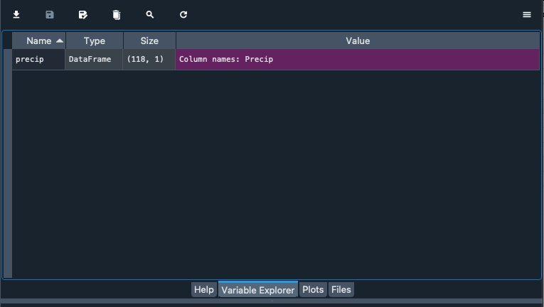
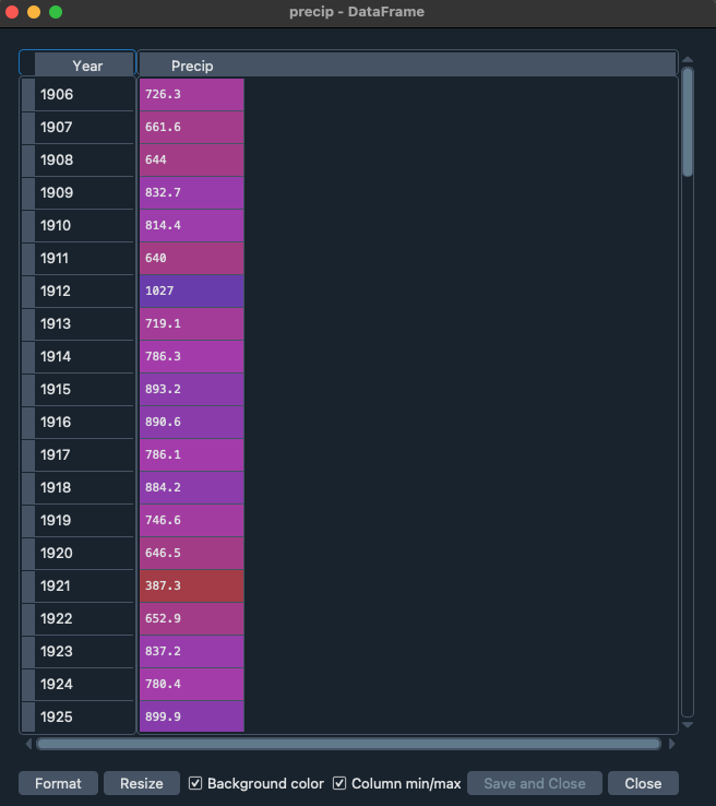
Alternatively you can explore the data with the variable explorer that you find within Spyder
Starting with Pandas data analysis
Next we go and look at the data by visualizing the data. Within Pandas there are multiple opportunities to explore and visualize the data. There are lots of resources to help you with using Pandas and provide nice tips, trick and examples. For example you can use a cheat sheet to quickly remember and double check which functions to use (e.g. https://pandas.pydata.org/Pandas_Cheat_Sheet.pdf). You can also find lots of good examples that use Pandas online for different types of data and types of analysis (https://realpython.com/search?q=pandas).
Normal distributions
On of the first things we often do is test if data follows a Gaussian distribution and is thus normally distributed. This typically means that the sample we have obtained is the result of many random sample from a distribution. Common example are the height or weight of people, but it is also very common in many examples in the Earth sciences like air temperature.
Central limit theorem
In research, to get a good idea of a population mean ($\mu$), ideally you’d collect data from multiple random samples within the population. A sampling distribution of the mean is the distribution of the means of these different samples.
From probability theory, we know the following asymptotic statements:
Law of Large Numbers: As you increase sample size (or the number of samples), then the sample mean will approach the population mean.
Central limit theorem: With multiple large samples, the sampling distribution of the mean is normally distributed, even if your original variable is not normally distributed.
Parametric statistical tests typically assume that samples come from normally distributed populations, but the central limit theorem means that this assumption isn’t necessary to meet when you have a large enough sample.
You can use parametric tests for large samples from populations with any kind of distribution as long as other important assumptions are met. It depends on how heterogenous your data is, but large samples in the earth sciences can range from 30 records to 10.000 of thousands of observations.
Testing if your data is normally distributed
You can test if a dataset is normally distributed, either with a visual inspection of the data or a statistical test. Below we will explore both options.
TipQuestion 1
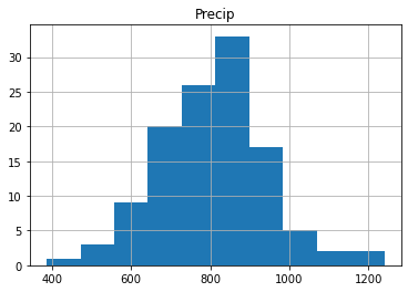
Let’s start with a visual inspection. A good way to start is to make a histogram of you data. Use the cheat sheet to explore which function to use to make a histogram of the precipitation data.
If you did it well you will find something like the image below, with the x-axis giving the different bins for annual precip ranging from roughly \(400-1200~mm~y^{-1}\). The y-axis gives the number of years in each bin. You can see some of the distinct bell-shape that is to be expected from a normal distribution, but we can dive in a bit further.
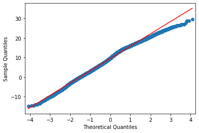
Another way is making a quantile-quantile plot of your data.
import scipy.stats as ss
## For the quantile plot, we need to extract the column from the dataframe that contains the precipitation data. You can get the column names of a dataframe df using df.columns. Here, we have only one column named "Precip", containing precipitation data."

# Calculate the quantiles of the precipitation data
real_quantiles = precip["Precip"].quantile(q=np.linspace(0.01, 0.99, 100))

# Calculate the theoretical quantiles of a normal distribution
norm_quantiles = ss.norm.ppf(np.linspace(0.01, 0.99, 100))

# Create the Q-Q plot
plt.scatter(norm_quantiles, real_quantiles)
plt.xlabel("Theoretical Quantiles (Normal Distribution)")
plt.ylabel("Real Quantiles")
plt.title("Q-Q Plot")

# Add a line of perfect agreement
plt.plot([norm_quantiles[0], norm_quantiles[-1]], [real_quantiles.iloc[0], real_quantiles.iloc[-1]], color='r')
plt.show()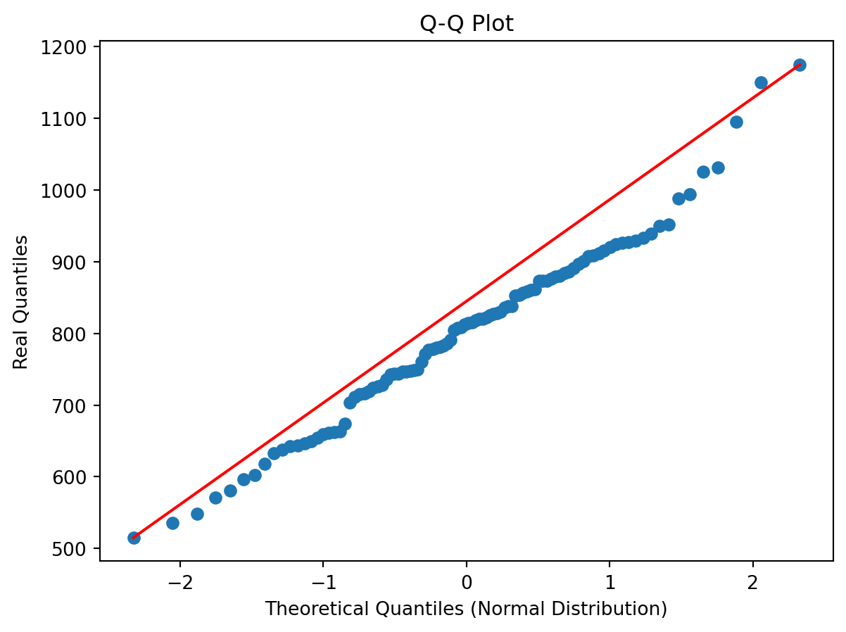
In the figure you see the theoretical quantiles of the normal distribution and how the data (y-axis) relates to that. If the data is perfectly normally distributed it would fall on the red line.
TipQuestion 2
Would you say the data is normally distributed based on this visual inspection of the data and why?
There is also a more quantitative way of checking if data is normally distributed, which is using a statistical normality test. One of the more commonly used test for this is the Shapiro Wilk Test. The Shapiro-Wilk test evaluates a data sample and quantifies how likely it is that the data was drawn from a Gaussian distribution, named for Samuel Shapiro and Martin Wilk. In practice, the Shapiro-Wilk test is believed to be a reliable test of normality, although there is some suggestion that the test may be suitable for smaller samples of data, e.g. thousands of observations or fewer. Note that the Shapiro-Wilk test examines the null hypothesis that the data is normally distributed. If it returns a p value lower than 0.05, the null hypothesis “the data follows a normal distribution” is rejected.
TipQuestion 3
Try to implement the Shapiro Wilks test in Python on the precip dataset. You can use the function stats.shapiro, for which you find the manual here.
If you did everything well you find that:
ShapiroResult(statistic=0.9821208214707591, pvalue=0.11845170228364588)Since the p-value is above 0.05 we can assume that the data follows a normal distribution and is thus normally distributed.
Testing if two samples have the same mean
Let’s start by exploring some statistical properties of the rainfall data, starting with the mean annual precipitation and its standard deviation.
print(precip.mean())
print(precip.std())
Precip 802.147458
dtype: float64
Precip 139.186794
dtype: float64You can see that the Netherlands has a mean \(\pm\) standard deviation (1 \(\sigma\)) of around \(802\pm139~mm~y^{-1}\) precipitation. This amount varies year by year, and thus it can matter how many years of data you have to get the mean values. One of the important element is the amount of years of observations that are available. We will now explore the impact of the length of the data record on the value we find for the average annual precipitation.
TipQuestion 4
Can you now make a piece of code that identifies how many year of data we have? There are two ways of exploring this, which can be using a function that checks the length or the shape of the Pandas array (you can use Google to help you).
If you did everything well you found that the total data record contains 118 years of data. For now we assume that the value of 800mm per year is the true mean (µ) value of the annual precipitation in the Netherlands. Next we want to explore how many years of observations are needed to find the true value of annual precipitation. We will now use sub-samples of the full data record to see how many years we need. Let’s start by sub-sampling some of the data and computing and testing if the sample mean accurately captures the true mean (for which we now assume to be the +/- 800mm of the full data record).
precip = pd.read_csv("../Data/annualPrecipitation.csv", parse_dates=True, index_col=0)
samplePrecip = precip.sample(n = 5, replace = False, random_state=1)
print(samplePrecip)
Precip
Year
2000-01-01 932.4
1960-01-01 928.7
1965-01-01 1151.9
2021-01-01 861.3
1980-01-01 861.8replace = False indicates that every year should be only selected once and no years should be sampled twice. random_state=1 is a way of guaranteeing that the same random numbers are selected and thus the same random years (this is mostly convenient if you want to reproduce your code, like for this practical). Now we would like to see if the average value that we obtain from the sample is a good representation of the total time series and thus represents the total true mean.
samplePrecip.mean()Precip 947.22
dtype: float64You will find that the mean precipitation for this sample is \(947~mm~y^{-1}\), compared to the \(802~mm~y^{-1}\) for the entire sample. You can see that these two values are different, but the question is if they are also statistically different. For this you will do an hypothesis test. The first step in constructing a hypothesis test is to be clear about what the null and alternative hypotheses are. This isn’t too hard to do. Our null hypothesis \(H_{0}\), is that the true population mean \(\mu\) for annual precipitation is \(802~mm~y^{-1}\); and our alternative hypothesis is that the population mean isn’t \(802~mm~y^{-1}\). If we write this in mathematical notation, these hypotheses becomes
\[ H_{0}:\mu_{1} = \mu_{2} \] \[ H_{1}:\mu_{1}\neq\mu_{2} \]
though to be honest this notation doesn’t add much to our understanding of the problem, it’s just a compact way of writing down what we’re trying to learn from the data. Before we can do this we need to make a couple of assumptions about the data:
The two samples are independent
The data is normally distributed
The data have a similar variance
If you think these assumptions are valid we could use a t-test to test our hypothesis.
TipQuestion 5
Do you think all of these criteria are met or do you see one that might be violated and if so why?
For now let’s assume all those criteria are met and we can move on and perform an independent sample t-test. While you can also do this by hand following the appropriate equations in this course we like to focus on using and analysing the data rather than focussing on the exact mathematical equations. It is however important to understand when you can and can’t use a certain test of approach. Luckily the independent sample t-test is available from the Scipy packages (a common package for statistical analysis). You can perform the test using:
stats.ttest_ind(precip, samplePrecip)TtestResult(statistic=array([-2.29273885]), pvalue=array([0.02359]), df=array([121.]))Python will return three values to you, the first is the so-called t-statistic, the p-value which indicates the likelihood of \(H_{0}\) to be true and df the degrees of freedom, the higher this value the more samples you typically used. In this situation you can see that the \(H_{0}\) is rejected (p-value < 0.05) and thus we use the alternative hypothesis \(H_{1}\). This means that with just 5 years of precipitation data we cannot accurately estimate the average annual precipitation over the Netherlands for the Bilt.
TipQuestion 6
Find the number of years required to accurately represent the annual precipitation in the Bilt (\(\mu_{1}\)).
Looking for trends in your data
With climate change meteorological variables are likely to change, we know that temperatures are increasing but what about precipitation. We could test this by looking splitting our long timeseries into multiple parts and checking if the mean annual precipitation is changing.
TipQuestion 7
Make a timeseries plot of the long-term precipitation dataset by using the .plot function.
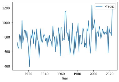
If all went well you find the plot above. By looking at the data there are no clear trends in the data. We can also do a more quantitative approach using techniques that you have used before in this assignment.
Make two sub-sample of the data one containing the first 30 years of the data and one containing the last 30 years of the data. You have two ways of doing so (look at you cheat sheet for Pandas). The first one is to use the .head() and .tail() functions.
firstYearsPrecip = precip.head(30)
lastYearsPrecip = precip.tail(30)
print(firstYearsPrecip)
print(lastYearsPrecip)
Precip
Year
1906-01-01 726.3
1907-01-01 661.6
1908-01-01 644.0
1909-01-01 832.7
1910-01-01 814.4
1911-01-01 640.0
1912-01-01 1027.0
1913-01-01 719.1
1914-01-01 786.3
1915-01-01 893.2
1916-01-01 890.6
1917-01-01 786.1
1918-01-01 884.2
1919-01-01 746.6
1920-01-01 646.5
1921-01-01 387.3
1922-01-01 652.9
1923-01-01 837.2
1924-01-01 780.4
1925-01-01 899.9
1926-01-01 708.1
1927-01-01 874.8
1928-01-01 814.3
1929-01-01 630.4
1930-01-01 911.1
1931-01-01 770.5
1932-01-01 744.0
1933-01-01 510.9
1934-01-01 716.8
1935-01-01 915.0
Precip
Year
1994-01-01 1025.2
1995-01-01 729.5
1996-01-01 575.7
1997-01-01 743.5
1998-01-01 1239.6
1999-01-01 901.5
2000-01-01 932.4
2001-01-01 1038.9
2002-01-01 924.0
2003-01-01 612.7
2004-01-01 859.4
2005-01-01 872.9
2006-01-01 807.1
2007-01-01 951.1
2008-01-01 880.5
2009-01-01 776.9
2010-01-01 825.3
2011-01-01 909.0
2012-01-01 878.3
2013-01-01 827.2
2014-01-01 872.9
2015-01-01 853.3
2016-01-01 838.0
2017-01-01 947.5
2018-01-01 582.0
2019-01-01 934.2
2020-01-01 855.9
2021-01-01 861.3
2022-01-01 820.9
2023-01-01 1179.6There is also another option using the .iloc() function:
firstYearsPrecip = precip.iloc[:30]
lastYearsPrecip = precip.iloc[-30:]
print(firstYearsPrecip)
print(lastYearsPrecip)
Precip
Year
1906-01-01 726.3
1907-01-01 661.6
1908-01-01 644.0
1909-01-01 832.7
1910-01-01 814.4
1911-01-01 640.0
1912-01-01 1027.0
1913-01-01 719.1
1914-01-01 786.3
1915-01-01 893.2
1916-01-01 890.6
1917-01-01 786.1
1918-01-01 884.2
1919-01-01 746.6
1920-01-01 646.5
1921-01-01 387.3
1922-01-01 652.9
1923-01-01 837.2
1924-01-01 780.4
1925-01-01 899.9
1926-01-01 708.1
1927-01-01 874.8
1928-01-01 814.3
1929-01-01 630.4
1930-01-01 911.1
1931-01-01 770.5
1932-01-01 744.0
1933-01-01 510.9
1934-01-01 716.8
1935-01-01 915.0
Precip
Year
1994-01-01 1025.2
1995-01-01 729.5
1996-01-01 575.7
1997-01-01 743.5
1998-01-01 1239.6
1999-01-01 901.5
2000-01-01 932.4
2001-01-01 1038.9
2002-01-01 924.0
2003-01-01 612.7
2004-01-01 859.4
2005-01-01 872.9
2006-01-01 807.1
2007-01-01 951.1
2008-01-01 880.5
2009-01-01 776.9
2010-01-01 825.3
2011-01-01 909.0
2012-01-01 878.3
2013-01-01 827.2
2014-01-01 872.9
2015-01-01 853.3
2016-01-01 838.0
2017-01-01 947.5
2018-01-01 582.0
2019-01-01 934.2
2020-01-01 855.9
2021-01-01 861.3
2022-01-01 820.9
2023-01-01 1179.6If you want to select specific year you can use:
firstYearsPrecip = precip.loc["1906":"1935"]
lastYearsPrecip = precip.loc["1994":"2023"]
print(firstYearsPrecip)
print(lastYearsPrecip)
Precip
Year
1906-01-01 726.3
1907-01-01 661.6
1908-01-01 644.0
1909-01-01 832.7
1910-01-01 814.4
1911-01-01 640.0
1912-01-01 1027.0
1913-01-01 719.1
1914-01-01 786.3
1915-01-01 893.2
1916-01-01 890.6
1917-01-01 786.1
1918-01-01 884.2
1919-01-01 746.6
1920-01-01 646.5
1921-01-01 387.3
1922-01-01 652.9
1923-01-01 837.2
1924-01-01 780.4
1925-01-01 899.9
1926-01-01 708.1
1927-01-01 874.8
1928-01-01 814.3
1929-01-01 630.4
1930-01-01 911.1
1931-01-01 770.5
1932-01-01 744.0
1933-01-01 510.9
1934-01-01 716.8
1935-01-01 915.0
Precip
Year
1994-01-01 1025.2
1995-01-01 729.5
1996-01-01 575.7
1997-01-01 743.5
1998-01-01 1239.6
1999-01-01 901.5
2000-01-01 932.4
2001-01-01 1038.9
2002-01-01 924.0
2003-01-01 612.7
2004-01-01 859.4
2005-01-01 872.9
2006-01-01 807.1
2007-01-01 951.1
2008-01-01 880.5
2009-01-01 776.9
2010-01-01 825.3
2011-01-01 909.0
2012-01-01 878.3
2013-01-01 827.2
2014-01-01 872.9
2015-01-01 853.3
2016-01-01 838.0
2017-01-01 947.5
2018-01-01 582.0
2019-01-01 934.2
2020-01-01 855.9
2021-01-01 861.3
2022-01-01 820.9
2023-01-01 1179.6The advantage of this method is that you can specify years you want to select. Also if they are not situated at the start of end of the timeseries. You can do the same with the iloc function, but in that case you do need to identify the exact row numbers of interest.
TipQuestion 8
Make a small script that selects the first and last 30 years of data and then tests if the mean of the two dataset are different or not. You can use the loc function and apply a independent sample t-test to the data to find the answer. In other words:
\[ H_{0}:\mu_{1906-1935} = \mu_{1994-2023} \]
\[H_{1}:\mu_{1906-1935}\neq\mu_{1994-2023} \]
Investigating a new dataset
Now it is time to use the skills you have just obtained on a new dataset “dailyTemperature.csv”.
TipQuestion 9
Please explore the following things
Plot the data as a timeseries
Is this dataset normally distributed
Using a graphical method (example with precipitation above)
Using the Shapiro test
Explore graphically if there are trends and try to quantify the trends by comparing the period 1901-1930 to 1990-2019.
Test is the the year 2021 was significantly warmer than 2022
Findings
If all went well you find that the data is not normally distributed, that there is a deviation from the normal distribution especially in the higher temperature values as can be seen from the plot below.
If you explored the data you will also see that there are strong trends in the temperature data as can be expected with climate change.
Processing your timeseries data
There are some tricks that can help you to better work with your data. You might have seen that the temperature data you got was not with an annual timestep but was actually the daily data from the Bilt weather station. There are tricks to easily aggregate your time data to different timescales. For example you can compute the annual mean temperature with:
Tas = pd.read_csv("../Data/dailyTemperature.csv", parse_dates=True, index_col=0)
annualTas = Tas.resample("YE").mean()
## If you use an older version of pandasit could be that you have to use annualTas = Tas.resample("Y").mean()
You can also find the annual minimum and maximum temperatures in a fairly similar manner
annualMinTas = Tas.resample("YE").min()
annualMaxTas = Tas.resample("YE").max()
## If you use an older version it could be that you have to use "Y" again
TipQuestion 10
Explore if the annual mean, min and max temperature are normally distributed.
TipQuestion 11
Could you explain why some of these new annual data are normally distributed and the daily timeseries are not. If it helps try to plot the daily data for the year 2022 using the loc and plot functions
TipQuestion 12
*Try and write the annual temperature data to a csv file. For this you can use the .to_csv function to write the Pandas dataframe to a csv file.
TipQuestion 13
The final year has no complete data, what would you propose to do with the data from this year?
Understanding the Dutch climate
We will load some new data
Tas = pd.read_csv("../Data/dailyTemperature.csv", parse_dates=True, index_col=0).dropna()
Precip = pd.read_csv("../Data/dailyPrecipitation.csv", parse_dates=True, index_col=0).dropna()
Evap = pd.read_csv("../Data/dailyEvaporation.csv", parse_dates=True, index_col=0).dropna()
We will now try and obtain the seasonal cycle for the climate for these meteorological data. To do this we will add an additional data column to the data, folliwing the example from the first practical with the weekdays. Now we will use Julian Days which in Python is the day of the year since 1 Jan of that year.
julianDays = Tas.index.strftime("%j")
df_julian = pd.DataFrame({'Julian':julianDays}, columns=['Julian'], index=Tas.index)
TasJulian = Tas.join(df_julian)
TipQuestion 14
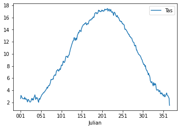
Now we will obtain the seasonal cycle and get an understanding of the climate in the Netherlands. You can use the groupby() function again and obtain the average temperature throughout the year. Write the outcome into the variable cycleTas (to be just further down). Do this and also create a line plot with the Temperature data.
If all is well the plot should look something like:
If you inspect the data closely you will see that there are 366 values, this is due to leap years that have 366 days. For convenience we will drop the last year to make sure that the data is more consistent.
cycleTas = cycleTas.iloc[0:-1]Following question 8 we can also look at the seasonal cycles for selected time periods.
TipQuestion 15
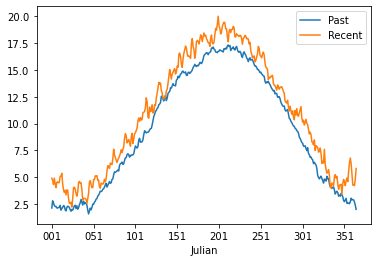
Make two new dataframe with the seasonal data for 1901-2003 and 2004-2023. Plot the data in a figure by merging the two dataframes. For plotting you can use the .plot function, for selecting specific periods you can use the .loc function and by adding the second calculation to the first dataframe using a code like df[“Recent”] = …..
If you did everything well you should have something that looks like this:
TipQuestion 16
Now we will go and further look at the precipiation data. Load the precipitation data and create a second column that has the month numbers included. Again use strftime to find the right way to do this. Please calculate the monthly sum and not mean. Also don’t forget to drop any nan data. Do this for the period 1964-2023, which is a total of 60 years.
If all is well you got the following outcome or something close.
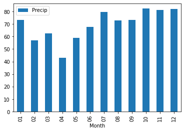
          Precip
Month
01     69.567351
02     56.572918
03     60.436938
04     46.175040
05     61.306343
06     68.947775
07     80.471549
08     75.453320
09     71.989026
10     79.393954
11     82.485170
12     82.053799
TipQuestion 17
Now plot the monthly precipitation cycle for the Netherlands using a bar plot option in pandas plot.
The result should look something like this.
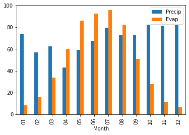
TipQuestion 18
Now do the same for the evaporation data for 1964-2023 and plot the monthly evaporation cycle the Netherlands using a bar plot option in pandas plot and add this to the precipitation plot.
If you did everything well you should obtain an image that look like this
You can also explore the plotting that can be done with the seaborn package to provide more advanced plotting options and design. We will provide a simple example below.
import seaborn as sns
g = sns.lineplot(x='Julian', y = "Tas", data=TasJulian)
g.set_xticks(range(0,365,30)) # <--- set the ticks first
g.set_xticklabels(range(0,365,30))
[Text(0, 0, '0'),
Text(30, 0, '30'),
Text(60, 0, '60'),
Text(90, 0, '90'),
Text(120, 0, '120'),
Text(150, 0, '150'),
Text(180, 0, '180'),
Text(210, 0, '210'),
Text(240, 0, '240'),
Text(270, 0, '270'),
Text(300, 0, '300'),
Text(330, 0, '330'),
Text(360, 0, '360')]
This figure also provide the uncertainty on the seasonal cycle analysis. We will not dive further into seaborn, but you now have a sense of the plotting options that are available in Python also for future work.
Seasonal decomposition
It can be useful to understand the trends in your data or to remove the seasonal cycle from your data. We can do this using the seasonal_decompose function that remove the trend and seasonality and just leave the residuals.
from statsmodels.tsa.seasonal import seasonal_decompose

decompose_Tas = seasonal_decompose(Tas, period = 365)
plt = decompose_Tas.plot()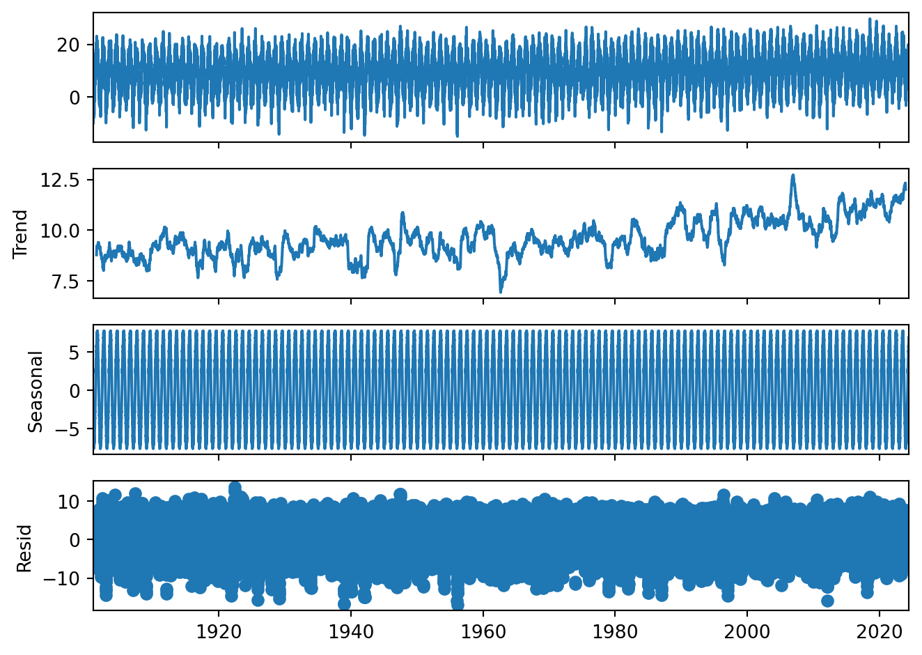
Gives you a total overview of the data. Please note that the seasonal cycle is just deviations from the trend. That is why we can have negative seasonal temperatures even though we have no long frost periods in the Netherlands.
TipQuestion 19
Looking back at results, would you think based on this that there is a temperature trend? And why?
Do your own data exploration
Q = pd.read_csv("../Data/dailyDischarge.csv", parse_dates=True, index_col=0)
TipQuestion 20
You have loaded the daily discharge data for the Rhine river, now start and exploring. You should make the following things:
Create the monthly discharge data timeseries
Are there trends in discharge data
Make two discharge climatology figures using the techniques described in Question 14 for the period 1901-1930 and 1991-2020
Test the following hypothesis \[ H_{0}:\mu_{1901-1930} = \mu_{1991-2020} \] \[ H_{1}:\mu_{1901-1930}\neq\mu_{1991-2020} \]
What you have learned today
If all is well you have learned today:
Explore data
Test for normal distributions
Look for trends
Use hypothesis testing
Calculate climatology and seasonal cycles of datasets