import pandas as pd
import numpy as np
from sklearn.decomposition import PCA
import matplotlib.pyplot as plt


sites = pd.read_csv('../Data/Pol_site.csv')
poll_surf = pd.read_csv('../Data/Pol_surf.csv')

poll_sq = poll_surf.apply(np.sqrt)PCA of the pollen data from Scandinavia
During last week’s exercise we classified a pollen surface sample dataset from Scandinavia. A PCA allows us to explore the actual composition of that dataset. Many text books will tell you that you should first standardize your data before computing a PCA. In fact whether or not you should do that depends on your data. Where the scales of the values of different observations are different a standardisation is necessary, but where all measurements are on the same scale standardization is often not desired. On the other hand, we learned last week, that pollen data are best transformed prior to any further analysis to improve the signal to noise ratio and we will thus start the data manipulation with a square root transformation.
TipQuestion 1
Have a look at the original data that we work with. What are the dimension of the dataframe? How many taxa and samples are there?
Running a PCA using scikit-learn starts with initializing a PCA object. The analysis on the data is only carried out using its ‘fit’ method.
poll_pca = PCA()
poll_pca.fit(poll_sq)PCA()In a Jupyter environment, please rerun this cell to show the HTML representation or trust the notebook.
On GitHub, the HTML representation is unable to render, please try loading this page with nbviewer.org.
Parameters
Fitted attributes
100 features
| pca0 |
| pca1 |
| pca2 |
| pca3 |
| pca4 |
| pca5 |
| pca6 |
| pca7 |
| pca8 |
| pca9 |
| pca10 |
| pca11 |
| pca12 |
| pca13 |
| pca14 |
| pca15 |
| pca16 |
| pca17 |
| pca18 |
| pca19 |
| pca20 |
| pca21 |
| pca22 |
| pca23 |
| pca24 |
| pca25 |
| pca26 |
| pca27 |
| pca28 |
| pca29 |
| pca30 |
| pca31 |
| pca32 |
| pca33 |
| pca34 |
| pca35 |
| pca36 |
| pca37 |
| pca38 |
| pca39 |
| pca40 |
| pca41 |
| pca42 |
| pca43 |
| pca44 |
| pca45 |
| pca46 |
| pca47 |
| pca48 |
| pca49 |
| pca50 |
| pca51 |
| pca52 |
| pca53 |
| pca54 |
| pca55 |
| pca56 |
| pca57 |
| pca58 |
| pca59 |
| pca60 |
| pca61 |
| pca62 |
| pca63 |
| pca64 |
| pca65 |
| pca66 |
| pca67 |
| pca68 |
| pca69 |
| pca70 |
| pca71 |
| pca72 |
| pca73 |
| pca74 |
| pca75 |
| pca76 |
| pca77 |
| pca78 |
| pca79 |
| pca80 |
| pca81 |
| pca82 |
| pca83 |
| pca84 |
| pca85 |
| pca86 |
| pca87 |
| pca88 |
| pca89 |
| pca90 |
| pca91 |
| pca92 |
| pca93 |
| pca94 |
| pca95 |
| pca96 |
| pca97 |
| pca98 |
| pca99 |
Let us extract the data that was produced.
poll_scor = poll_pca.transform(poll_sq)
poll_comp = poll_pca.components_
TipQuestion 2
What are these two matrices? You may guess when you compare their dimension to the dimension of the original data?
Start plotting the sample scores for the first two principal components:
fig , ax = plt.subplots(1, 1, figsize=(8, 8))
ax.scatter(poll_scor[:,0], poll_scor[:,1])
ax.set_xlabel('PC 1')
ax.set_ylabel('PC 2')
Text(0, 0.5, 'PC 2')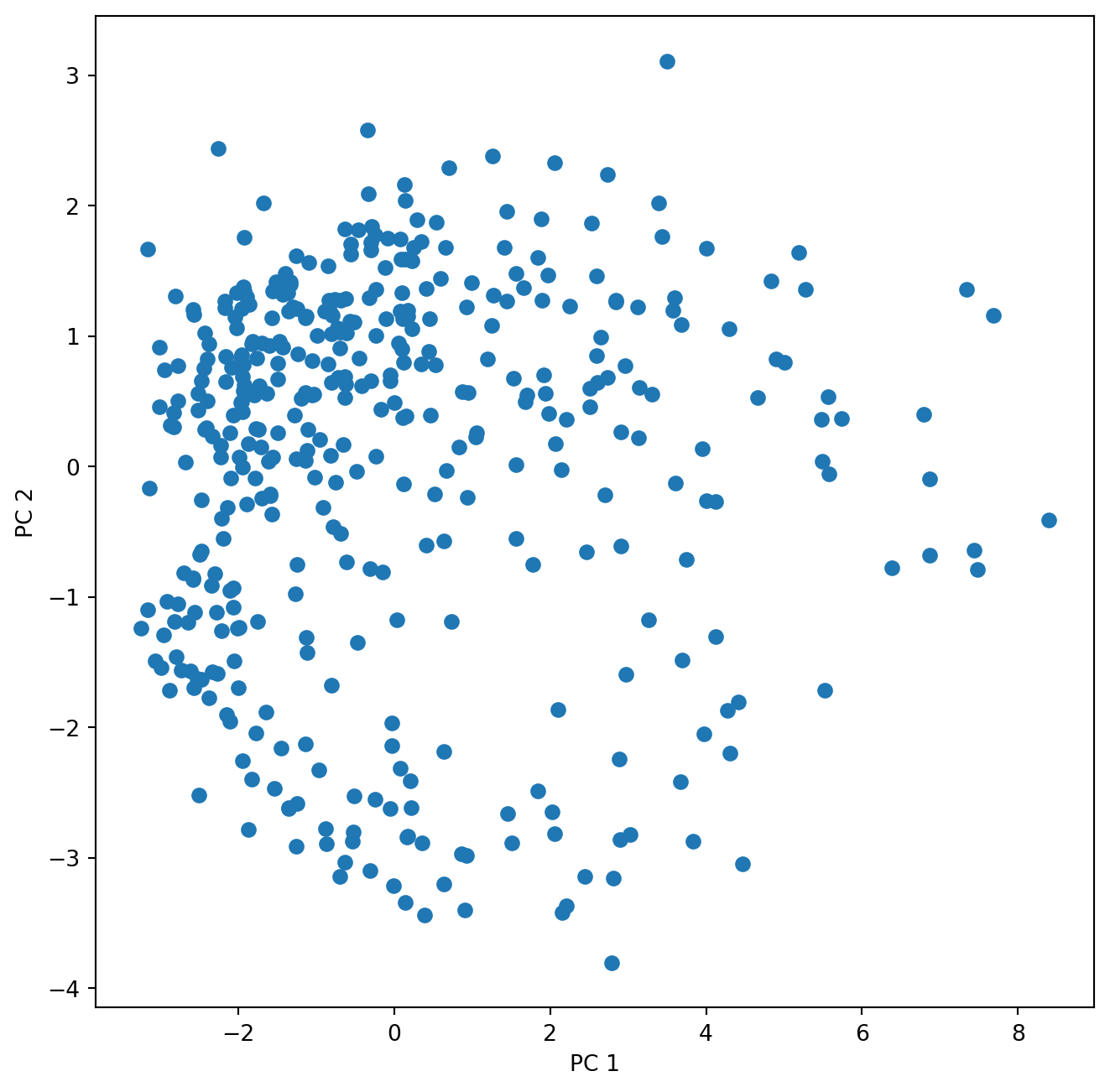
The second matrix holds the loadings, which describe how much each variable contributes to a particular principal component. These loadings are usually visualized as vectors together with the sample scores in a biplot. Can we just plot them into the same figure?
fig , ax = plt.subplots(1, 1, figsize=(8, 8))
ax.scatter(poll_scor[:,0], poll_scor[:,1])
ax.set_xlabel('PC 1')
ax.set_ylabel('PC 2')
for k in range(poll_comp.shape[1]):
       ax.arrow(0, 0, poll_comp[0,k], poll_comp[1,k], head_width = 0.05, head_length = 0.1)
       ax.text(poll_comp[0,k],poll_comp[1,k],poll_sq.columns[k])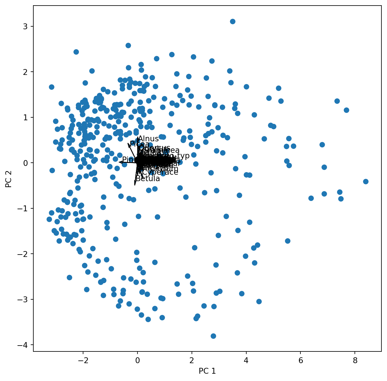
Well …this works but we cannot see anything. So let us first look at the loadings (species scores) alone.
fig , ax = plt.subplots(1, 1, figsize=(8, 8))
for k in range(poll_comp.shape[1]):
       ax.arrow(0, 0, poll_comp[0,k], poll_comp[1,k], head_width = 0.02, head_length = 0.05)
       ax.text(poll_comp[0,k],poll_comp[1,k],poll_sq.columns[k])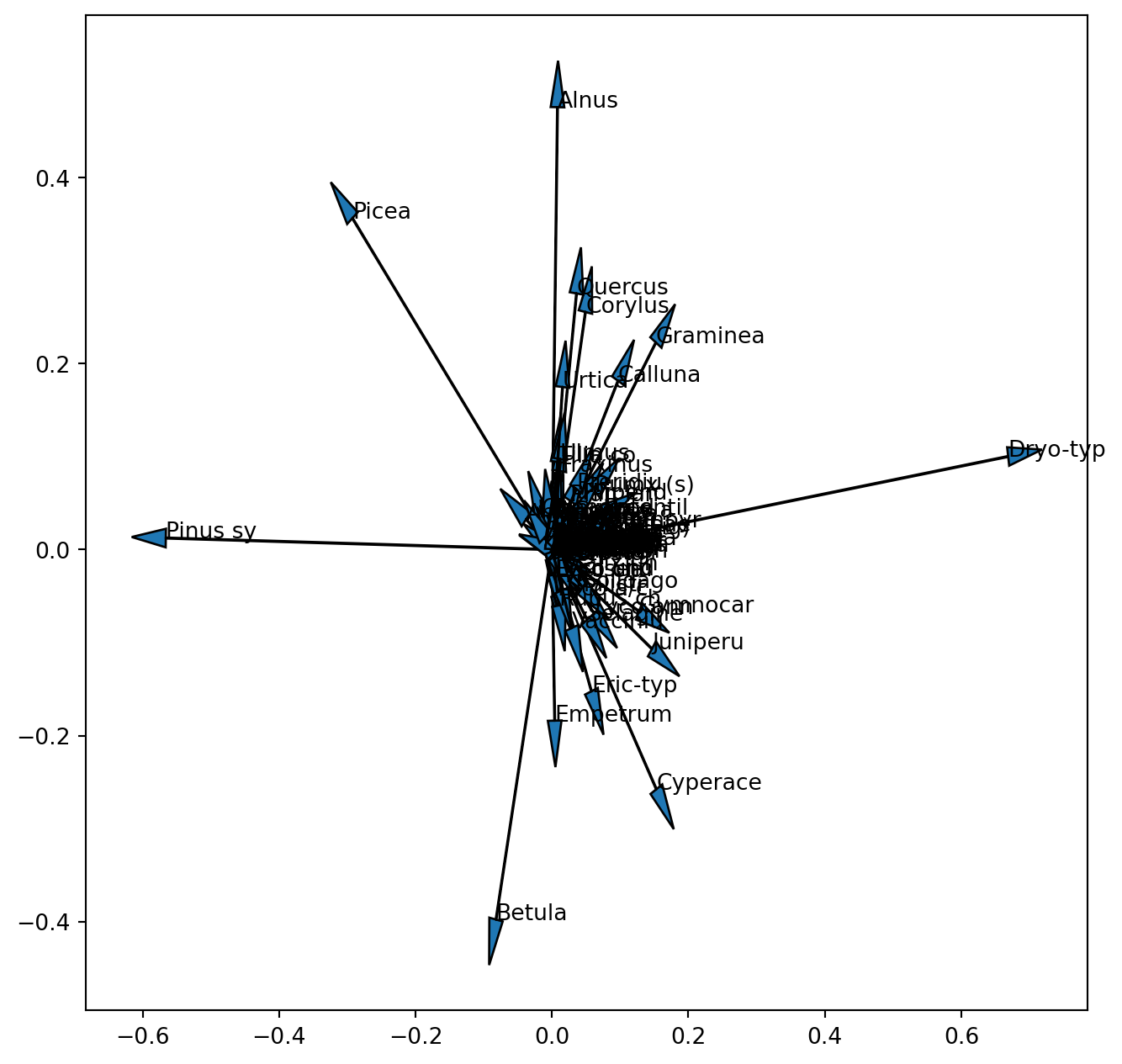
We already realized that the scales of these two entities are different and one (samples) or the other (species) or both have to be rescaled (note this is not the scaling 1 / 2, but only an aid to visualize the results). Now we also see that we are not able to see the vectors for the 100 pollen taxa of the original dataset. Since we did not standardize the data before the PCA, species with a low variance and low absolute values will have tiny loadings near the centre of the coordinate system. When interpreting a biplot these species will not be informative so it will be best not to plot their vector. We can look at the variance of the square root transformed data to select only pollen taxa with a high variance.
var = poll_sq.var(axis = 0)
var.plot(ylim=(0, 1))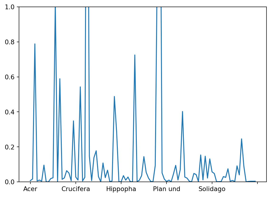
Finding an adequate threshold for selection is a question of making the final graph readable without omitting too much information. Let us here decide on a threshold of 0.2. Thus we use the criterion that the variance needs to exceed 0.2 producing an index of True and False. From the Boolean list we get the index for the variables ‘True’.
index = poll_sq.var(axis = 0)>0.2
select = [i for i, val in enumerate(index) if val]
The resulting list of selected pollen taxa can be used in the plotting of the vectors. Thus our selection only affects the plot but not the analysis. We also learned that we need to scale one or both of the components in order to make the plot more readable. Thus we introduce a scale factor for the vectors.
scale_arrow = s_ = 10
fig , ax = plt.subplots(1, 1, figsize=(8, 8))
ax.scatter(poll_scor[:,0], poll_scor[:,1])
ax.set_xlabel('PC 1')
ax.set_ylabel('PC 2')
for k in select:
       ax.arrow(0, 0, s_*poll_comp[0,k], s_*poll_comp[1,k], head_width = 0.05, head_length = 0.1)
       ax.text(s_*poll_comp[0,k],s_ * poll_comp[1,k],poll_sq.columns[k])
plt.show() 
Before we go on let us look at the biplot and interpret it.
TipQuestion 3
Add the circle of equilibrium descriptor contribution to the plot. Was the threshold for plotting the descriptor vectors well chosen?
TipQuestion 4
Which pollen taxa hold the largest variance of the dataset that is captured by the first and second principal axis?
TipQuestion 5
Which pollen taxa are highly correlated? You can answer this judging the above biplot. However, remember that scaling 2 is better suited for that. Can you scale and plot the vectors for the selected taxa. Hint: during scaling you transpose the matrix.
TipQuestion 6
Which pollen taxa are not at all correlated in the data?
Now we like to know how much of the variance is actually explained by the first two PC axis and how many of the PC axis we should look at.
The answer to the first question is easily extracted:
poll_pca.explained_variance_ratio_[0:10] # Here we only look at the first 10 PCsarray([0.36990526, 0.14321587, 0.09855086, 0.08679366, 0.04661818,
0.02839027, 0.02099509, 0.01898521, 0.01503161, 0.01404976])As with last week’s question on the number of clusters there is also no clear cut answer on the number of PC that may be relevant, but also here a scree plot provides some information.
fig , ax = plt.subplots(1, 1, figsize=(8, 8))
ticks = range(1, 101)
ax.plot(ticks, poll_pca.explained_variance_ratio_, marker='o')
ax.set_xlabel('Principal Component');
ax.set_ylabel('Proportion of Variance Explained')
ax.set_ylim([0,0.4])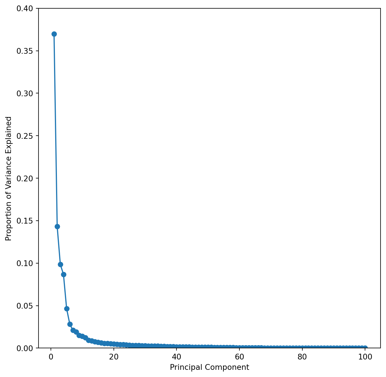
This scree plot nicely shows that the first few PC capture most of the variance.
TipQuestion 7
To get a better look at this and also to estimate the position of the elbow it is useful to plot the cumulative variance explained for the first 50 PC’s. You can modify the above code, but may want to set the y-axis limits to 0.35 and 1.
Finding the elbow is somewhat subjective, but we can agree that the first 4 components would certainly be worthwhile looking at. Using the broken stick model (available in R) suggests that the first 5 components reduce the variance more than a random process and should therefore be considered. 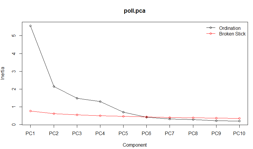
Finally we can also consult the Kaiser-Guttman criterion suggesting to only consider those principal components whose variances exceed 1.
# Calculate the number of principal components with variances greater than 1
kaiser_rule = np.where(poll_pca.explained_variance_ > 1)[0]
print(kaiser_rule)
[0 1 2 3]With also Kaiser suggesting to look at more than the first two components - we should do that. Modifying the above script by introducing indices for the component to plot (i, j) we can easily explore components 1 to 5.
i, j = 0, 1 # which components
scale_arrow = s_ = 10
fig , ax = plt.subplots(1, 1, figsize=(8, 8))
ax.scatter(poll_scor[:,i], poll_scor[:,j])
ax.set_xlabel('PC%d' % (i+1))
ax.set_ylabel('PC%d' % (j+1))
for k in select:
       ax.arrow(0, 0, s_*poll_comp[i,k], s_*poll_comp[j,k], head_width = 0.05, head_length = 0.1)
ax.text(s_*poll_comp[i,k],s_ * poll_comp[j,k],poll_sq.columns[k]) 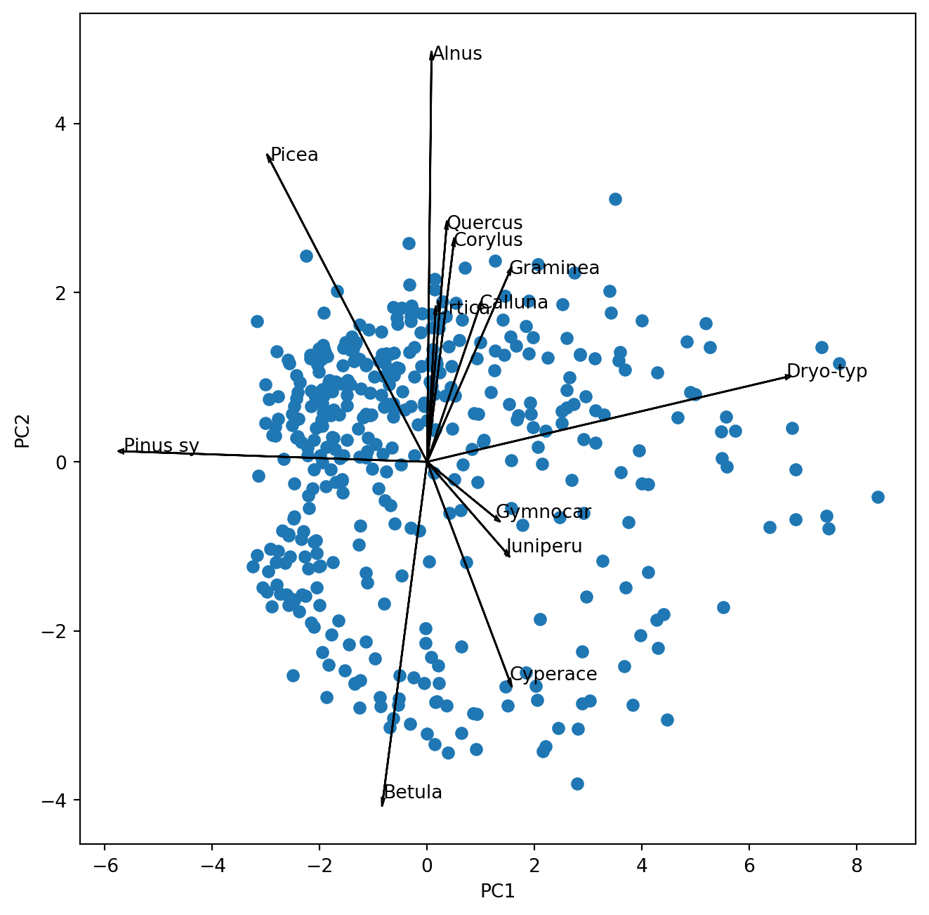
TipQuestion 8
Which pollen taxa characterize the principal component 5?
Combining PCA and cluster analysis
Working with the same data last week we created a cluster analysis of the data. Now we want to see where these clusters are falling in the PCA space. So let us repeat the cluster analysis from last week using my preferred clustering with ward linkage using the Euclidean distance after square-root transformation:
import scipy.spatial.distance as distance
from scipy.cluster.hierarchy import linkage
from scipy import cluster

poll_sq = poll_surf.apply(np.sqrt)
d = distance.pdist(poll_sq,'euclidean')
Z = linkage(d,'ward')

poll_class = cluster.hierarchy.cut_tree(Z, n_clusters=3)
We obtain our class assignments in the in the object “poll_class” which we can use in the PCA plot to identify the samples by colour.
i, j = 0, 1 # which components
scale_arrow = s_ = 10
fig , ax = plt.subplots(1, 1, figsize=(8, 8))
scatter = ax.scatter(poll_scor[:,i], poll_scor[:,j], c = poll_class)
legend1 = ax.legend(*scatter.legend_elements(),
                    loc="lower right", title="Class")
ax.set_xlabel('PC%d' % (i+1))
ax.set_ylabel('PC%d' % (j+1))
for k in select:
       ax.arrow(0, 0, s_*poll_comp[i,k], s_*poll_comp[j,k], head_width = 0.05, head_length = 0.1)
       ax.text(s_*poll_comp[i,k],s_ * poll_comp[j,k],poll_sq.columns[k])
plt.show() 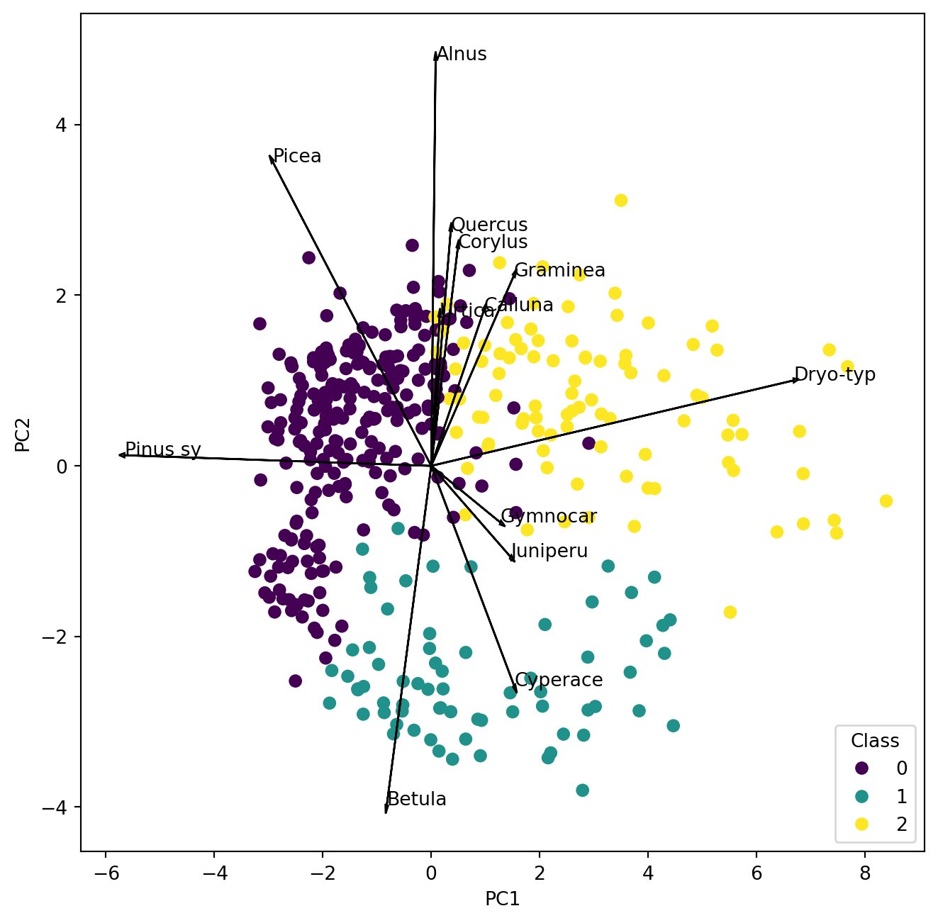
TipQuestion 9
Make a new map like last week and compare the clusters in the PCA with the clusters on the map. Where is cluster 1 located and which two pollen types characterize the samples?
Multi-dimensional scaling
Metric multi-dimensional scaling is available from ‘scikit-learn’ which also claims to do the non-metric variant. However, testing it only yielded interpretable results for metric scaling so we will have a quick look at what that does. It is not an eigenvector method and we can use it with pre-computed dissimilarities. Thus we go back to the SciPy package where we had a good choice of dissimilarities to see how they may influence the ordination of samples.
from sklearn import manifold
import scipy.spatial.distance as distance

poll_d = distance.pdist(poll_sq,'braycurtis')
poll_ds = distance.squareform(poll_d)

mds = manifold.MDS(
    n_components=2,
    max_iter=3000,
    eps=1e-12,
    dissimilarity='precomputed',
    metric=True
    )
p_mds = mds.fit_transform(poll_ds)

fig , ax = plt.subplots(1, 1, figsize=(8, 8))
scatter = ax.scatter(p_mds[:,0], p_mds[:,1], c = poll_class)
legend1 = ax.legend(*scatter.legend_elements(),
                    loc="lower right", title="Class")
plt.xlabel('MDS1')
plt.ylabel('MDS2')
plt.title("Bray–Curtis dissimilarity")
plt.show()
/home/runner/.local/lib/python3.12/site-packages/sklearn/manifold/_mds.py:735: FutureWarning: The default value of `init` will change from 'random' to 'classical_mds' in 1.10. To suppress this warning, provide some value of `init`.
warnings.warn(
/home/runner/.local/lib/python3.12/site-packages/sklearn/manifold/_mds.py:752: FutureWarning: The `dissimilarity` parameter is deprecated and will be removed in 1.10. Use `metric` instead.
warnings.warn(
/home/runner/.local/lib/python3.12/site-packages/sklearn/manifold/_mds.py:760: FutureWarning: Use metric_mds=True instead of metric=True. The support for metric={True/False} will be dropped in 1.10.
warnings.warn(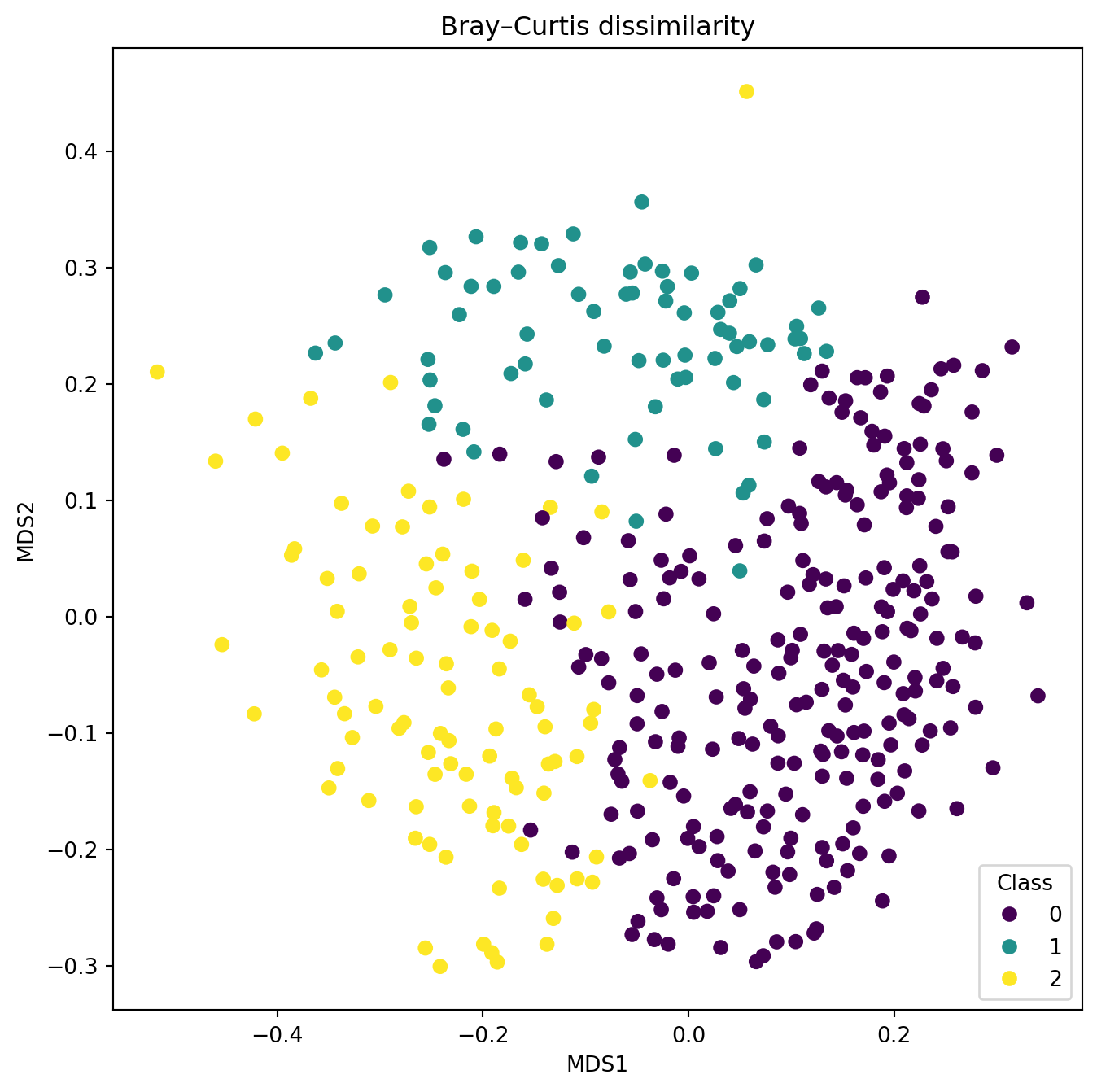
TipQuestion 10
Try out the effect of different distances with the aim to find one that separates the predefined groups better than the PCA. Create alt least two plots with different distances.
Using PCA to compare trends
We got two datasets obtained from the same samples of a 26 m long sediment core: pollen proportions and geochemical analysis results.
Tchem = pd.read_csv('../Data/Trep_geoChem.csv')
Tpoll = pd.read_csv('../Data/Trep_pol.csv')
Have a look at the data. Information on the sample depth is in Tchem:
depth = Tchem["depth"]Tchem also contains the variable ‘water content’, which together with depth we don’t want to use in any analysis. Thus we need to extract the variables that are meaningful.
Tchem_s = Tchem[["Fe","Ca","Al","Mg","Mn","P","org"]]
TipQuestion 11
You want to compare the trends in both datasets: Asking the question if changes in the lake catchment recorded by the pollen composition may have lead to changes in the lake itself recorded by the sediment chemistry? Both datasets are multivariate thus the best way to compare them is to reduce the dimensions and only compare the first principal axes scores for the samples. Don’t forget that one or the other dataset needs standardisation or transformation prior to PCA. Please also report how much variance is explained by the respective first PC.