import matplotlib.pyplot as plt
import pandas as pd
import numpy as np
from statsmodels.tsa.seasonal import seasonal_decompose
from statsmodels.tsa.stattools import acf, pacf
from statsmodels.graphics.tsaplots import plot_acf, plot_pacf
from statsmodels.tsa.arima.model import ARIMA
import statsmodels.formula.api as smSeasonality and autocorrelation
In Geoscience we often measure a variable though time. Just like in regression analysis, we may want to characterise the change through time. But in time series analysis, we have to account for the fact that the measurements are not independent. For example, the \(CO_2\) level in the atmosphere in 2021 depends on the \(CO_2\) level in 2020. This is called autocorrelation.
We will follow the textbook’s chapter 11.7 and use data on the trends in atmospheric carbon dioxide from the National Oceanic and Atmospheric Administration (NOAA, Fig. 11.9). In 1958, C.D. Keeling started monitoring \(CO_2\) levels in the Mauna Loa Observatory on Hawaii. It was the first continuous monitoring programme and provided evidence for the rise of \(CO_2\) concentration in the atmosphere. You can find more about it on the curve’s official website.
Exercise based on T. Haslwanter’s textbook materials.
Code
The original dataset is provided in a format that is not easy for automatic machine reading (e.g. the column headers occupy different number of lines). So to read it in, you would need to make it machine-friendly, e.g. one row = one observation. We provide this cleaned dataset for you.
Read in the dataset:
path = '../Data/monthly_in_situ_co2_mlo.csv'
df = pd.read_csv(path, sep=',')
Preview the dataset:
df.head()| Year | Month | CO2 | |
|---|---|---|---|
| 0 | 1958 | 3 | 315.71 |
| 1 | 1958 | 4 | 317.45 |
| 2 | 1958 | 5 | 317.51 |
| 3 | 1958 | 6 | 317.27 |
| 4 | 1958 | 7 | 315.87 |
If we wanted to plot the values in time, we could currently do it either by month number, or by the year, but not both. You need to create an extra variable that will represent the time in a continuous manner.
Solution
df['time'] = df['Year'].map(str) + '.' + df['Month'].map(str)Visualize it:
df.plot('time', 'CO2')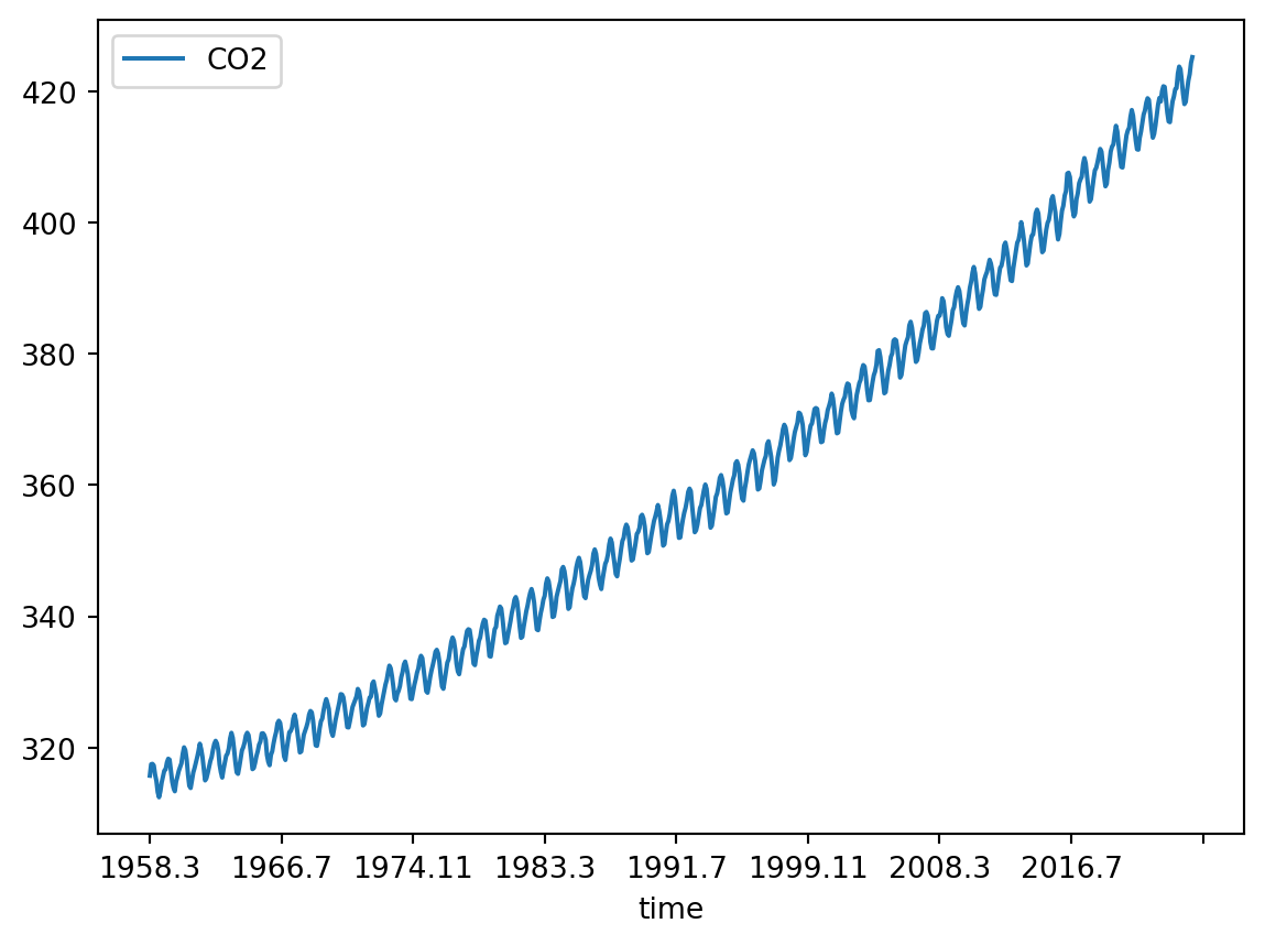
Decomposition into trend, seasonality, and residuals
TipQuestion 01
In practical 2, you learned how to decompose a time series into a seasonal trend and a linear trend. How do you apply the same function to the \(CO_2\) dataset? Find the code in practical 2 and modify it.
TipQuestion 02
After removing the seasonal fluctuations, do you see a secular (i.e. non-seasonal) trend in the \(CO_2\) dataset? Can you plot it?
Lagged regression on the trend
In the case of the \(CO_2\) data, the secular trend is of wide interest and we might want to know how fast it is increasing.
Now we have to account for the fact that \(CO_2\) levels in each year depend on the value in the previous year. This is why we cannot apply regression analysis to the entire \(CO_2\) variable. But we can use the i - 1 value to predict the ith value.
We use the ‘shift’ function to create a new variable that is the the i - 1 value of the trend.
trend = pd.DataFrame(result_add.trend)
trend['time'] = df['time']
trend['predicted'] = trend['trend'].shift(1)
Now we can use ordinary least squares regression to fit a model that predicts the current trend value based on the previous one:
model_fit = sm.ols('predicted~trend', data=trend).fit()
print(model_fit.summary2())
Results: Ordinary least squares
===================================================================
Model: OLS Adj. R-squared: 1.000
Dependent Variable: predicted AIC: -2632.0954
Date: 2026-07-07 19:22 BIC: -2622.7463
No. Observations: 792 Log-Likelihood: 1318.0
Df Model: 1 F-statistic: 3.689e+08
Df Residuals: 790 Prob (F-statistic): 0.00
R-squared: 1.000 Scale: 0.0021043
---------------------------------------------------------------------
Coef. Std.Err. t P>|t| [0.025 0.975]
---------------------------------------------------------------------
Intercept 0.3718 0.0187 19.8533 0.0000 0.3350 0.4085
trend 0.9986 0.0001 19207.5819 0.0000 0.9985 0.9987
-------------------------------------------------------------------
Omnibus: 13.241 Durbin-Watson: 0.297
Prob(Omnibus): 0.001 Jarque-Bera (JB): 13.877
Skew: -0.276 Prob(JB): 0.001
Kurtosis: 3.341 Condition No.: 4138
===================================================================
Notes:
[1] Standard Errors assume that the covariance matrix of the errors
is correctly specified.
[2] The condition number is large, 4.14e+03. This might indicate
that there are strong multicollinearity or other numerical
problems.
TipQuestion 3
What are the coefficients of the model? Plot the line defined by these coefficients. You can do it using the coefficients from the model and a line equation (\(y = ax + b\)) or the model_fit.fittedvalues object that was created when you fitted the regression model. Does your regression model reflect the trend well? To check that, overlie the data from which the model had been calculated on the same plot.
Seasonality
Why is the \(CO_2\) level so variable during the year? And how regular is this variability? We might want to characterise it.
TipQuestion 5
Can you plot just the yearly cycle of \(CO_2\) across all the years?
Hint
You would need a horizontal axis with months and repeat the plotting over that interval for each year.
This can be done e.g. using afor-loop.
TipQuestion 6
What does the plot of average yearly cycle in \(CO_2\) values look like across all years of observation?
Hint
The methodgroupby of pandas may be useful here.
Residuals
Let’s look again at the trend decomposition plot:
result_add.plot()
plt.show()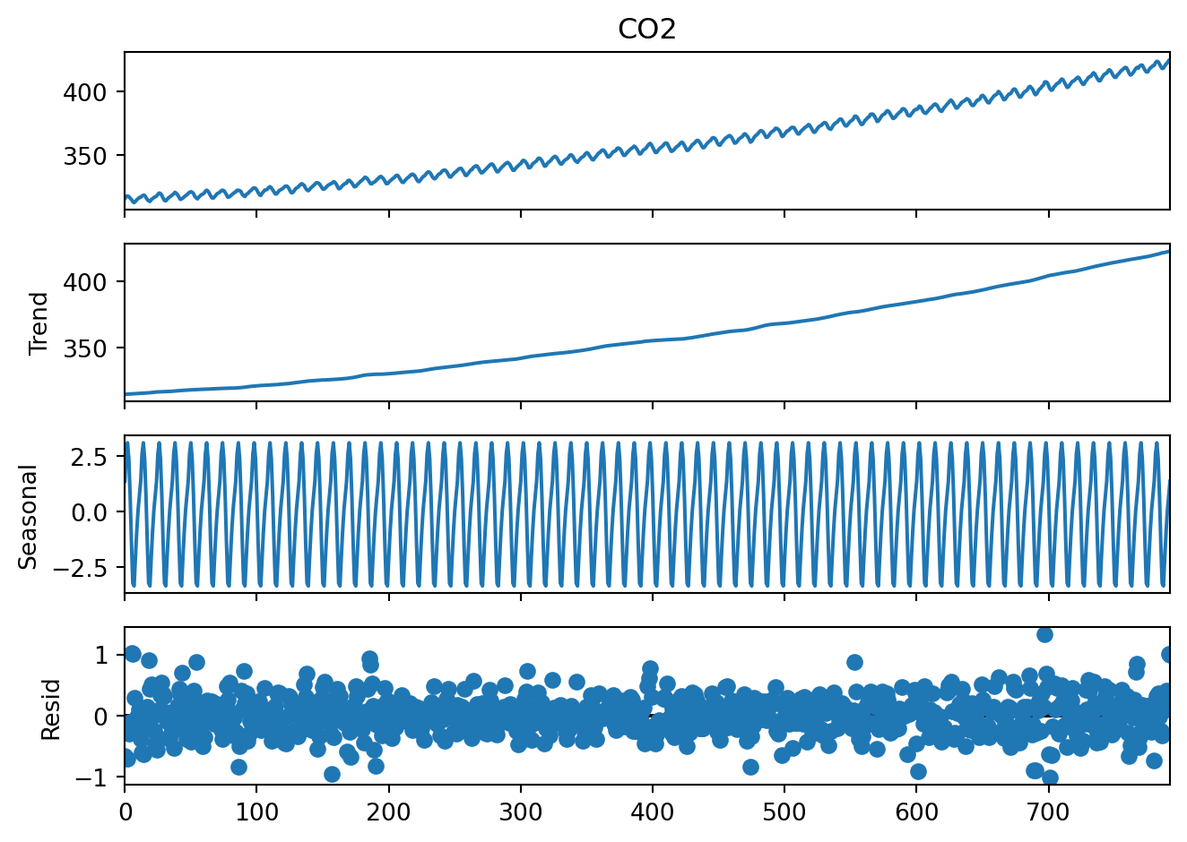
The first three plots are easy to interpret but what is the last one, residuals? These are the deviations from the trend and seasonality. So these are “anomalies” which cannot be explained by the seasonality or the continuous trend.
We might be interested in this, for example, to see if there are any extreme events in the \(CO_2\) levels, or is the overall variability of the \(CO_2\) levels increasing over time. This would tell us if a linear trend is a good model for this dataset.
plt.plot(result_add.resid, '-')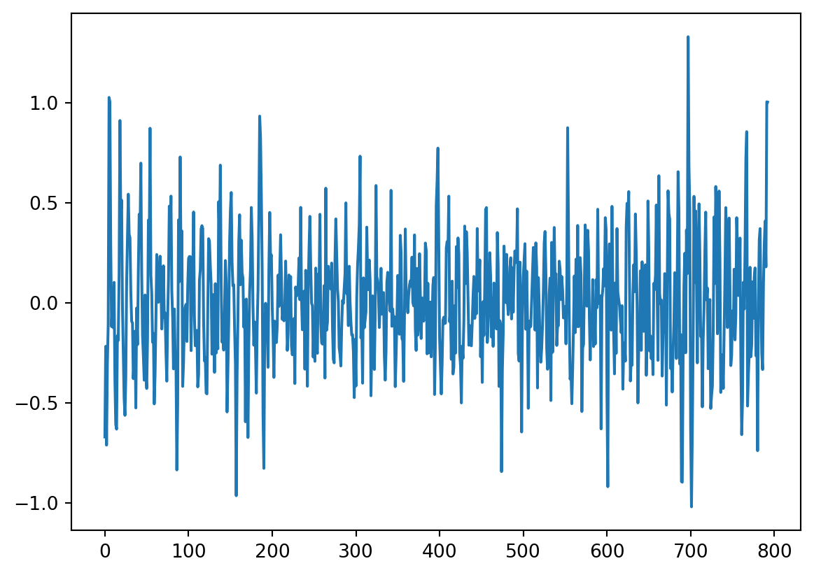
TipQuestion 7
Is there autocorrelation in the residuals? And why would this matter? For the second question, please take a look at the textbook chapter 11.7.2 - you will find there how to answer this question :-)
TipQuestion 8
What is the order of autocorrelation in the residuals?
Hint
We discussed in the lecture what plot you can use to identify the order of autocorrelation and you used it in the previous practical.Stationarity
Our original time series is not stationary.
TipQuestion 9
How can you make the time series stationary?
TipQuestion 10
Can you figure out how to difference the \(CO_2\) levels using the value from the same month? This would be differencing based on the differences between the same month in the year. Save the differenced data as differenced12.
Characterize autocorrelation
TipQuestion 11
On Tuesday, you learned how to estimate the order of an autoregressive process. What is the order of autocorrelation in the \(CO_2\) levels?
TipQuestion 12
What are the coefficients of the autoregressive process in the \(CO_2\) levels?
Hint
We used this in the previous practical. You can also find this in the textbook.Characterize a moving average process
If you have answered the previous questions, you will see that we can suspect that there is a moving average (MA) component in the \(CO_2\) time series. Use Table 11.2 in the textbook to find out how to characterise the MA component.
TipQuestion 13
What is the order of the moving average process in the \(CO_2\) levels? Please use the differenced12 dataset, because that is the stationary series.
Fit an ARMA model
Because you already differenced the time series by hand, you can fit a model that has an autoregressive component and a moving average component. The function ARIMA of course has I for “integrated”, but if we set the parameter d to 0, it will not difference the data, so we focus only on the AR and MA components.
Let’s fit the simplest case: an autoregressive process of order 2 and a moving average process of order 0.
model = ARIMA(differenced12[12:], order=(2, 0, 0))
model_fit = model.fit()
print(model_fit.summary())
SARIMAX Results
==============================================================================
Dep. Variable: CO2 No. Observations: 781
Model: ARIMA(2, 0, 0) Log Likelihood -399.657
Date: Tue, 07 Jul 2026 AIC 807.315
Time: 19:22:47 BIC 825.957
Sample: 0 HQIC 814.485
- 781
Covariance Type: opg
==============================================================================
coef std err z P>|z| [0.025 0.975]
------------------------------------------------------------------------------
const 1.6639 0.139 11.933 0.000 1.391 1.937
ar.L1 0.6558 0.033 19.992 0.000 0.592 0.720
ar.L2 0.2410 0.033 7.205 0.000 0.175 0.307
sigma2 0.1626 0.008 20.243 0.000 0.147 0.178
===================================================================================
Ljung-Box (L1) (Q): 0.40 Jarque-Bera (JB): 2.22
Prob(Q): 0.53 Prob(JB): 0.33
Heteroskedasticity (H): 1.51 Skew: 0.12
Prob(H) (two-sided): 0.00 Kurtosis: 3.12
===================================================================================
Warnings:
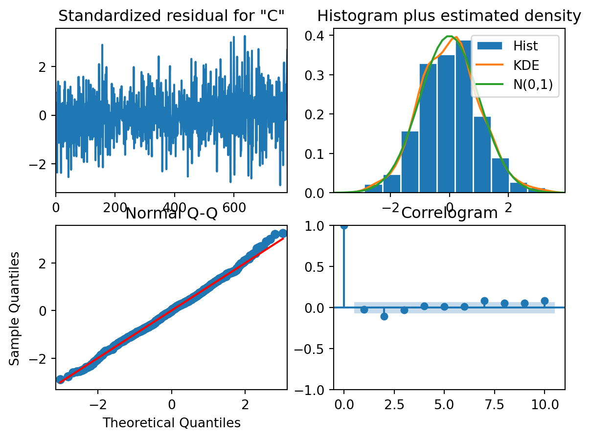
[1] Covariance matrix calculated using the outer product of gradients (complex-step).Plot diagnostics to check if the assumptions are not violated:
model_fit.plot_diagnostics()
TipQuestion 14
Are the residuals normally distributed?
TipQuestion 15
Are the residuals independent of each other?