import pandas as pd
import matplotlib.pyplot as plt
import numpy as np
import scipy.stats as stats

# Other libraries for wk4 for plots and maps
import seaborn as sns
import geopandas
from shapely import wkt

# Other libraries for wk4 with statistical models
from statsmodels.stats.multicomp import (pairwise_tukeyhsd, MultiComparison)
from statsmodels.formula.api import ols
from statsmodels.stats.anova import anova_lmMapping, plots and Variance
Sibes waddendata
We will be working with the same SIBES dataset as last week and continue with more intricate plotting and statistical analyses including multiple groups and interactions between variables.
We need to load some more libraries compared to last week including some to work with spatial data, do check if these load properly! if not, you may be working outside the recommended enviroment for this course, check out the installation instructions to make sure you have followed all steps. (the python version we use is 3.12, you can check this easy in the top bar of spyder. If you are using 3.11 or older you are not in the right environment)
We continue with the loaded data from last Thursdays exercises, copy you own code for loading and merging locationsediement.csv and locationbiota.csv. (or copy from the hint below…)
Hint
#load the sediment data, set column names and types
rawdata  = pd.read_csv("../Data/locationsediment.csv")
sediment = pd.DataFrame({
    "geom": rawdata['geom'],
    "date": pd.to_datetime(rawdata['date'], format='%Y-%m-%d'),
    "station_id": rawdata['sampling_station_id'],
    "sample_id": rawdata['sample_id'],
    "grainsize_median": rawdata['sediment_median'],
    "silt_proportion": rawdata['sediment_silt'],
     } )
# add year as a catergorical column for easy selection and merging
sediment['year'] = sediment['date'].dt.year

#load the biota data, set column names and types
rawdata  = pd.read_csv("../Data/locationbiota.csv")
biota = pd.DataFrame({
    "geom": rawdata['geom'],
    "date": pd.to_datetime(rawdata['date'], format='%Y-%m-%d'),
    "sampling_type": rawdata['sampling_type'].astype("category"),
    "sample_platform": rawdata['platform'].astype("category"),
    "tidal_basin_name": rawdata['tidal_basin_name'].astype("category"),
    "flat_name": rawdata['flat_name'].astype("category"),
    "species": rawdata['name'].astype("category"),
    "species_type": rawdata['type'].astype("category"),
    "species_aphia_id": rawdata['aphia_id'].astype("category"),
    "abundance_m2": rawdata['abundance_m2'],
    "biomass_afdm_m2": rawdata['afdm_m2'],
    } )
biota['year'] = biota['date'].dt.year

# Merge metadata
biota_metadata = biota[['year', 'geom', 'sampling_type',  'sample_platform', 'tidal_basin_name', 'flat_name']].drop_duplicates()
sibes_merged = pd.merge(left = sediment,
                        right = biota_metadata,
                        on = ['year', 'geom'],
                        how ='left')

# we cannot simply join the biomass values because they dont fit 1:1 but we can summerize them to the sample loctions/years and sum up all species.
biota_sums = biota.groupby(['geom', 'year'], observed=True).sum(numeric_only=True)
# Perform the merge on 'year' and 'geom'
sibes_merged = pd.merge(left = sibes_merged,
                        right =  biota_sums,
                        on =['year', 'geom'],
                        how ='inner')
for a more interesting analysis we want to retain more data, for example we can select specific species/groups or pivot to wide format with data columns for each entry. For this exercise we want to look not only at total biomass, but also biomass for individual species groups. We use the pivot_table function to create these for each of the groups.
# Pivot the data to get species types as separate columns
biomass_pertype = biota.pivot_table(
    index=['geom', 'year'],
    columns='species_type',
    values=['biomass_afdm_m2'],
    aggfunc='sum',
    observed=True,
    fill_value=0
)
# Check out the resulting dataframe it now has a multi level column header which makes things behave difficult for the further statistics and plotting (or for some functions is actually very handy...).
# Rename the columns  and flatten the dataframe.
biomass_pertype.columns = [f"{col[0]}_{col[1]}" for col in biomass_pertype.columns]
biomass_pertype = biomass_pertype.reset_index()

# Again merge the new data on 'year' and 'geom'
sibes_merged = pd.merge(sibes_merged, biomass_pertype, on=['year', 'geom'], how='inner')
The distributions of Biomass data are heavily skewed which does not make for nice plotting and reduces the usability of many statistical functions. We therefore log-transfer biomass to make the distribution closer to normal.
TipQuestion 01
Q1 you cannot log transform 0 (zero), what would be an appropriate value to replace zeroes in the transformed dataset? NaN could be used, but then you loose a lot of data points
# We replace zeroes with -3 for a really low value rather than with 0 which falls in the middle of our log-transformed range (suitable replacement depends on your dataset)
sibes_merged['polychaete_logbiomass'] = np.log10(sibes_merged['biomass_afdm_m2_polychaete'].mask(sibes_merged['biomass_afdm_m2_polychaete'] <= 0.0)).fillna(-5)
sibes_merged['bivalve_logbiomass'] = np.log10(sibes_merged['biomass_afdm_m2_bivalve'].mask(sibes_merged['biomass_afdm_m2_bivalve'] <= 0.0)).fillna(-5)
#Reorder the dataframe with the desired column order we leave some data columns out, but you can easily uncomment to retain them
sibes_merged = sibes_merged[[
'geom',
'station_id',
'date',
'year',
'sample_id',
'sampling_type',
'sample_platform',
'tidal_basin_name',
'flat_name',
'grainsize_median',
'silt_proportion',
#'abundance_m2',
'biomass_afdm_m2',
#'biomass_afdm_m2_bivalve',
#'biomass_afdm_m2_crustaceans',
#'biomass_afdm_m2_polychaete',
#'biomass_afdm_m2_other',
'polychaete_logbiomass',
'bivalve_logbiomass'
]]
# To not overwhelm our plots with to many points to see, we again limit the area and timespan of the data
sibes = sibes_merged.loc[sibes_merged['tidal_basin_name'].isin(["Marsdiep", "Eierlandse Gat", "Vlie", "Borndiep"] ) , : ]
sibes['tidal_basin_name'] = sibes['tidal_basin_name'].cat.remove_unused_categories()
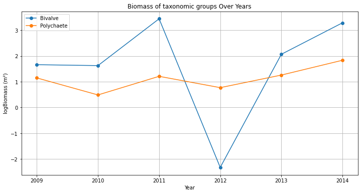
sibes = sibes.query('year == 2009') With all data neatly ordered, we can also make a quick selection (in this case of a single data point) and eg plot the changes in biomass trough the years for a single point
station = sibes_merged[sibes_merged['station_id'] == 2669]
plt.plot(station['year'], station['bivalve_logbiomass'], marker='o', linestyle='-', label='Bivalve')
plt.plot(station['year'], station['polychaete_logbiomass'], marker='o', linestyle='-', label='Polychaete')
plt.show()
TipQuestion 02
The figure created with the three lines above misses lots of thing, like legend, title, axes labels, and the lines/points are not in order of years… add to your code so the plot resembles the example below.
TipQuestion 03
This figure is not all that pretty yet, and everything is rather small. Make adjustments to the figure to make it well suited for a powerpoint presentation or poster (meaning it needs to be read from quite a distance). Save the figure as .png from your code (not via the gui) and import in in ppt, is everything still the same size and well readable? if not adjust size and resolution to make it work.
ANOVA and Seaborn plots
Seaborn is a Python data visualization library based on matplotlib. It provides a high-level interface for drawing attractive and informative statistical graphics.
Check out the example gallery of seaborn. Many of the example plots combine more that one plot type (scatterplot, line, histograms) to show how datasets are grouped, related, and distributed. some of these are good for data exploration, while others allow for more intricate storytelling.
sns.pairplot creates a scatterplot matrix which is a really good tool for exploring a dataset as it displays both fequency plots as scatteplots between a range of variables. You will need to limit the datase somewhat to not create giant unreadable matrices which take forever to generate…
#two examples. colored by sampling platform or by tidal basin

sns.pairplot(sibes[['sample_platform','tidal_basin_name','grainsize_median','silt_proportion','polychaete_logbiomass','bivalve_logbiomass']], hue='sample_platform')

sns.pairplot(sibes[['sample_platform','tidal_basin_name','grainsize_median','silt_proportion','polychaete_logbiomass','bivalve_logbiomass']], hue='tidal_basin_name')
TipQuestion 04
Check out he plot. did log-transforming make the the distibutions of biomass normal?
TipQuestion 5
Check out he plot. Which of the variables have the largest differences between basins? and sample platform?
Sums of squares
TipQuestion 6
Using the two sample platforms as groups, calculate the total sum of squares for median grainsize, the within group sum of squares and the between group sum of squares (use python, show your steps)
TipQuestion 7
Calculate the F statistic for the your samples. how many degrees of freedom do you use in the calculation?
We can also use the anova function to calculate similar statistics
#example anova
anova_lm( ols('grainsize_median ~ sampling_platform',sibes).fit())
TipQuestion 8
Run the ANOVA for sample platform on median grainsize with the anova_lm function. are your resuts the same as you hand calculation?
TipQuestion 9
For the two sample groups we could have also run a t-test on the sample means (as we did last week) rather than this ANOVA. compare the outcome when using F-test vs t-test how large are the differences?
For multiple groups we can use a combination of anova and the tukey_hsd tests to figure out if there are differences between the basins and which differences are significant. run an anova for the variable you think is most difference
#example anova for median grainssize and the tidal basins
anova_lm(ols('grainsize_median ~ tidal_basin_name',sibes).fit())

# if the anova indicates a significant difference, tukey_hsd can indicate which of the individual groups are different
MultiComparison(sibes['grainsize_median'], sibes['tidal_basin_name']).tukeyhsd().summary()
TipQuestion 10
Is there is significant difference between the group according to the anova? Which basins have significant differences? Explain in your own words what this result means.
Covariance and correlation
So far we have been looking at groups in data for comparison, but not relations between variables. Go back to your scatterplot matrix, but now look which variables are related.
TipQuestion 11
Which of the variables are related? which variables show no relation at all?
df.cov() and df.corr() calculation covariance and correlations between all variables in your dataframe (use numeric_only=True to avoid errors with date and categorical fields).
TipQuestion 12
which variables have the highest covariance values? which ones the strongest correlation? Why are these different?
TipQuestion 13
Disregard variables that are directly calculated from eachother (such as biomass and logbiomass), which variables in our data are strongly related?
TipQuestion 14
Based on group differences and correlations, select two related variables and one grouping variable that have an interesting story. Select and make one of the figure types from the seaborn gallery and make a pretty figure. set all relevant aesthetics to fit the data well.
Spatial data and maps
As you have seen when exploring the SIBES data online (and from the coordinate data in the our table), the SIBES data is spatial. That means it would be very logical to display it on a map. Details about mapping and spatial analysis are beyond the scope of this course (see GIS and Remote Sensing), but python has many tools to handle spatial information.
Geopandas is a library for Python that makes working with spatial data quite easy. To convert our dataframe to geopandas we have to indicate what the geometry (in our case point coordinates) of the dataframe is
# make this a spatial dataframe and plot a map
sibes["Coordinates"] = geopandas.GeoSeries.from_wkt(sibes["geom"])
geosibes = geopandas.GeoDataFrame(sibes, geometry='Coordinates', crs='epsg:4326')
TipQuestion 15
Make some plots using geosibes.plot(), try out at median grainsize and logbiomass as variables, or some other ones if you fancy. what is the difference between the plotting the non-spatial data as we have done before
there are many more fancier options such as using the geosibes.explore() function that creates en interactive map (with basemap) in your browser.
#NB there is a little but in Windows where the browswer does not directly return control to python when closing the window (or pressing ctr+c) after you close the window python will get control back after a few minutes... (press clt+. to restart the python kernel, you have to rerun the entire script (libraries, data loading etc) after that.
geosibes.explore(column='bivalve_logbiomass').show_in_browser()
Explore the bivalve biomass map. Where do the largest concentrations of clams occur in the studied part of the wadden sea? Is there a strong spatial relation between bivalves and sediment size?