import numpy as np
import matplotlib.pyplot as plt
from numpy.random import default_rng
from sklearn.decomposition import PCAPrincipal Component analysis PCA
PCA in small steps
Ordination techniques, such as PCA, were created to visualize and analyse patterns in data with many variables. However, multidimensional spaces are hard to visualize and it is therefore helpful to follow an example in just two dimensions that can be easily visualized. Note that you would normally never want to do a PCA with just two variables, but use techniques discussed earlier during the course. This example is based on the textbook “Python Recipes for Earth Sciences” by Martin Trauth (https://doi.org/10.1007/978-3-031-07719-7).
We start by building a random two dimensional dataset. You can think of the two variables as two different measurements such as length and width of pebbles on a river bank.Staying with this example of the length and width of pebbles, lets assume you have measured these across different river terrasses for which you also compiled other information. Now you need one single descriptor for the size of pebbles rather than using both length and width. The first principal component should summarize most of the variance of these two parameters and therefore be useful for that purpose.
rng = default_rng(0)
data = rng.standard_normal((30,2))
data[:,1] = 2 + 0.8*data[:,0]
data[:,1] = data[:,1] + \
    0.5*rng.standard_normal(np.shape(data[:,1]))
data[:,0] = data[:,0] +1
Let us look at the made up data in a scatter plot with the axis of the coordinate system intersect at the origin, which is done by: “set_position(‘zero’)”.
fig, ax = plt.subplots()
ax.plot(data[:,0],data[:,1], marker='o',
    linestyle='none')
for spine in ['top', 'right']:
    ax.spines[spine].set_visible(False)
for spine in ['left', 'bottom']:
    ax.spines[spine].set_position('zero')
plt.tight_layout()
plt.show() 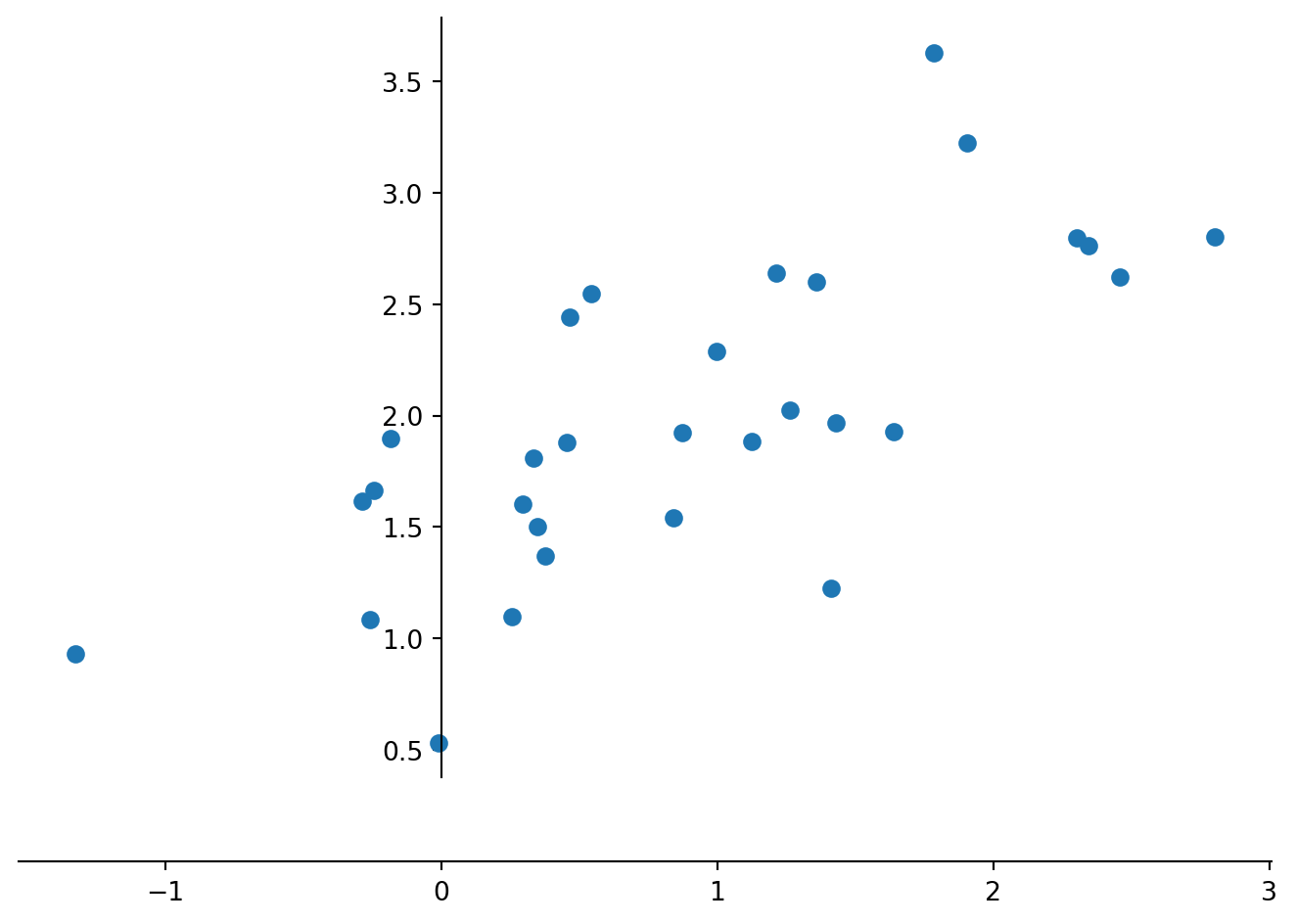
Computing a PCA by hand follows the steps: i) Standardize the data; ii) Compute the covariance matrix of the dataset; iii) Compute eigenvectors and the corresponding eigenvalues; iv) Sort the eigenvectors by decreasing eigenvalues and choose k eigenvectors; v) Form a matrix of eigenvectors and transform the original matrix. We start standardizing the data by subtracting the univariate means from the two variables (columns).
dataS = data
dataS[:,0] = dataS[:,0]-np.mean(dataS[:,0])
dataS[:,1] = dataS[:,1]-np.mean(dataS[:,1])

#using set_position('zero') we display the data in a coordinate system in which the coordinate axes intersect at the origin
#for loops are used here to avid typing the same command twice

fig, ax = plt.subplots()
ax.plot(dataS[:,0],data[:,1], marker='o',
    linestyle='none')
for spine in ['top', 'right']:
    ax.spines[spine].set_visible(False)
for spine in ['left', 'bottom']:
    ax.spines[spine].set_position('zero')
plt.tight_layout()
plt.show() 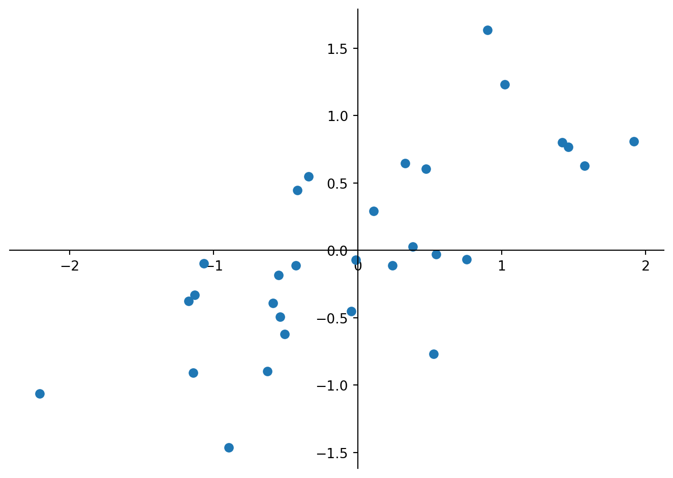
Next we calculate the covariance matrix for the whole dataset.
Cov = np.cov(dataS[:,0],dataS[:,1])
print(Cov)
[[0.92061706 0.49467367]
[0.49467367 0.50470029]]
TipQuestion 1
Calculate the variance of the initial data and compare the values to the obtained covariance matrix. Which values are identical and why? What is the overall variance of the data, and what is the proportion of variable ‘0’ (first column) of the overall variance? Hint: You may want to use pandas.DataFrame.var to calculate the variance, which requires a dataframe, while the following code assumes a NumPy array.
We see that the first column ‘0’ has the largest variance (column 0 versus row 0 in the matrix), which is what we observed in the scatter plot. Eigenvalues and eigenvectors of a given square array can be obtained with the help of NumPy as numpy.linalg.eig(). It will return two arrays: the first contains the eigenvalues and the second are the eigenvectors derived from the covariance matrix.
E_value, E_vect = np.linalg.eig(Cov)
print(E_value)
print(E_vect)
[1.24926722+0.j 0.17605013+0.j]
[[ 0.83292919+0.j -0.55337958+0.j]
[ 0.55337958+0.j 0.83292919+0.j]]
TipQuestion 2
How does the sum of eigenvalues compare to the total variance of the dataset and how much of that total variance is explained by the first principal component?
We see that the eigenvalues are in the right order and can plot the eigenvectors into the scatter plot of the standardized data.
fig, ax = plt.subplots()
ax.set(ylim=(-2, 2), xlim=(-2, 2)) # we set the axis limits
ax.set_aspect('equal', adjustable='box') # and fix the aspect to visualize right angles
ax.plot(dataS[:,0],dataS[:,1], marker='o',
    linestyle='none')
plt.plot((0,E_vect[0,0]),(0,E_vect[1,0]),
         color=(0.8,0.5,0.3),
         linewidth=0.75)
plt.text(E_vect[0,0],E_vect[1,0],'PC1',
         color=(0.8,0.5,0.3))
plt.plot((0,E_vect[0,1]),(0,E_vect[1,1]),
         color=(0.8,0.5,0.3),
         linewidth=0.75)
plt.text(E_vect[0,1],E_vect[1,1],'PC2',
         color=(0.8,0.5,0.3))
for spine in ['top', 'right']:
    ax.spines[spine].set_visible(False)
for spine in ['left', 'bottom']:
    ax.spines[spine].set_position('zero')
plt.tight_layout()
plt.show()
/home/runner/.local/lib/python3.12/site-packages/matplotlib/cbook.py:1810: ComplexWarning: Casting complex values to real discards the imaginary part
return math.isfinite(val)
/home/runner/.local/lib/python3.12/site-packages/matplotlib/cbook.py:1407: ComplexWarning: Casting complex values to real discards the imaginary part
return np.asanyarray(x, float)
/home/runner/.local/lib/python3.12/site-packages/matplotlib/text.py:1012: ComplexWarning: Casting complex values to real discards the imaginary part
x = float(self.convert_xunits(self._x))
/home/runner/.local/lib/python3.12/site-packages/matplotlib/text.py:1013: ComplexWarning: Casting complex values to real discards the imaginary part
y = float(self.convert_yunits(self._y))
/home/runner/.local/lib/python3.12/site-packages/matplotlib/text.py:863: ComplexWarning: Casting complex values to real discards the imaginary part
posx = float(self.convert_xunits(x))
/home/runner/.local/lib/python3.12/site-packages/matplotlib/text.py:864: ComplexWarning: Casting complex values to real discards the imaginary part
posy = float(self.convert_yunits(y))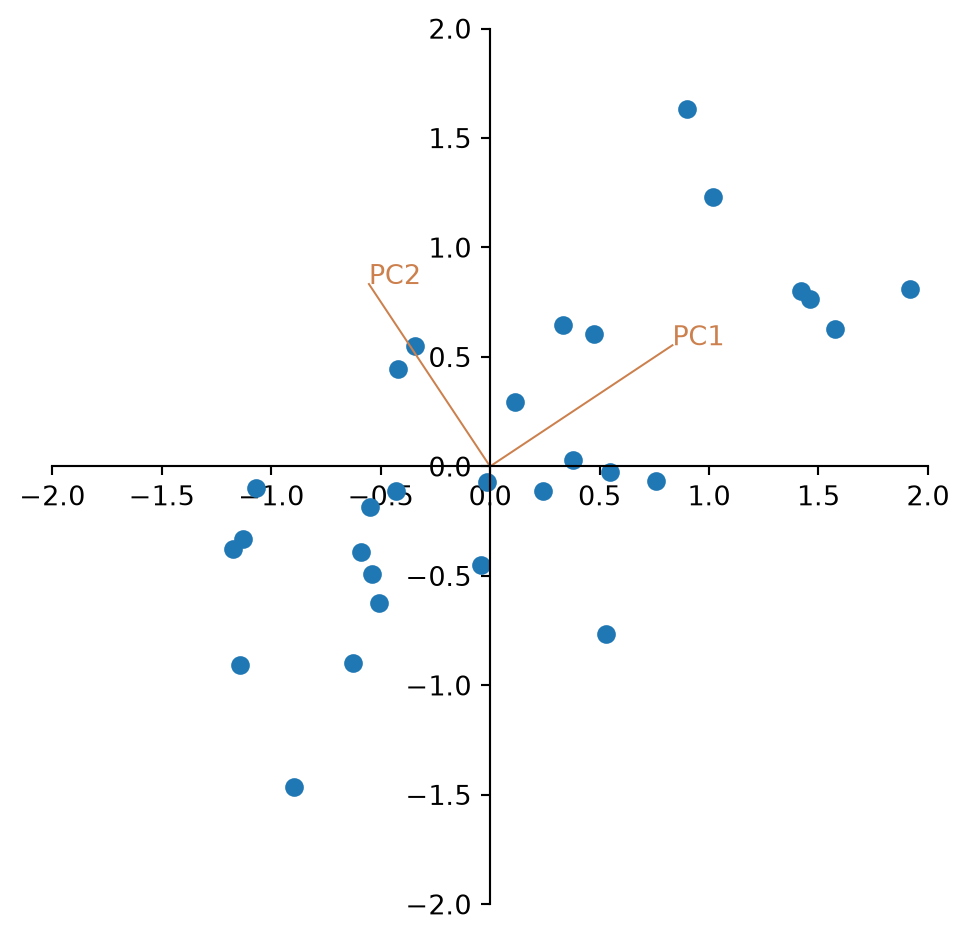
TipQuestion 3
Looking at the plot, the two eigenvectors have the same length. Why is that?
Finally we multiply the centred data with the eigenvectors and look at the new data.
newdata = np.matmul(dataS,E_vect)

fig, ax = plt.subplots()
ax.plot(newdata[:,0],newdata[:,1], marker='o',
    linestyle='none')
for spine in ['top', 'right']:
    ax.spines[spine].set_visible(False)
for spine in ['left', 'bottom']:
    ax.spines[spine].set_position('zero')
plt.xlabel('PC1',loc='right')
plt.ylabel('PC2',loc='top')
plt.tight_layout()
plt.show() 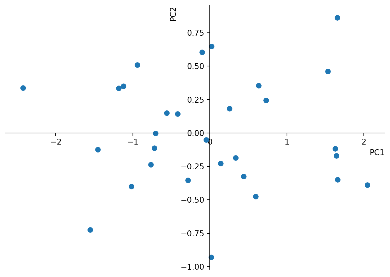
TipQuestion 4
Again, calculate the variance of the new matrix. Is it still the same? What does the variance of the individual columns correspond to?
TipQuestion 5
Where are the variable loadings? (Hint: Look in the matrix of eigenvectors.) Please add them to the plot as vectors in the same way we did with the PC before. What is the angle between them and why?
Coming back to the initial motivation of condensing the information of length and width of pebbles in river terraces to one single variable. We see now how the sample scores on the first principal coordinate summarize 88% of the variance. Ignoring 12% of the variance we may use only the samples scores on PC1 to characterize the size of pebbles.
You can do the same by just running the PCA using the sklearn library. Please note that this procedure will use “linear dimensionality reduction using Singular Value Decomposition (SVD)” rather than solving it using matrix calculations. Compare the obtained values. They must be the same.
pca = PCA(n_components=2)
pca.fit(data)
print(pca.components_) # shows you the sample
print(pca.explained_variance_ratio_)
Pnewdata = pca.transform(data)
[[ 0.83292919 0.55337958]
[-0.55337958 0.83292919]]
[0.87648355 0.12351645]There is actually one difference: The matrix of eigenvectors = ’pca.components_’is transposed. Thus the columns are variable loadings while the rows are PC.
TipQuestion 6
What do you find in the output ‘pca.explained_variance_’?
Also the plot will look the same.
fig, ax = plt.subplots()
ax.set(ylim=(-2, 2), xlim=(-2, 2))
ax.set_aspect('equal', adjustable='box')
ax.plot(Pnewdata[:,0],Pnewdata[:,1], marker='o',
    linestyle='none')
for spine in ['top', 'right']:
    ax.spines[spine].set_visible(False)
for spine in ['left', 'bottom']:
    ax.spines[spine].set_position('zero')
plt.xlabel('PC1',loc='right')
plt.ylabel('PC2',loc='top')
plt.tight_layout()
plt.show() 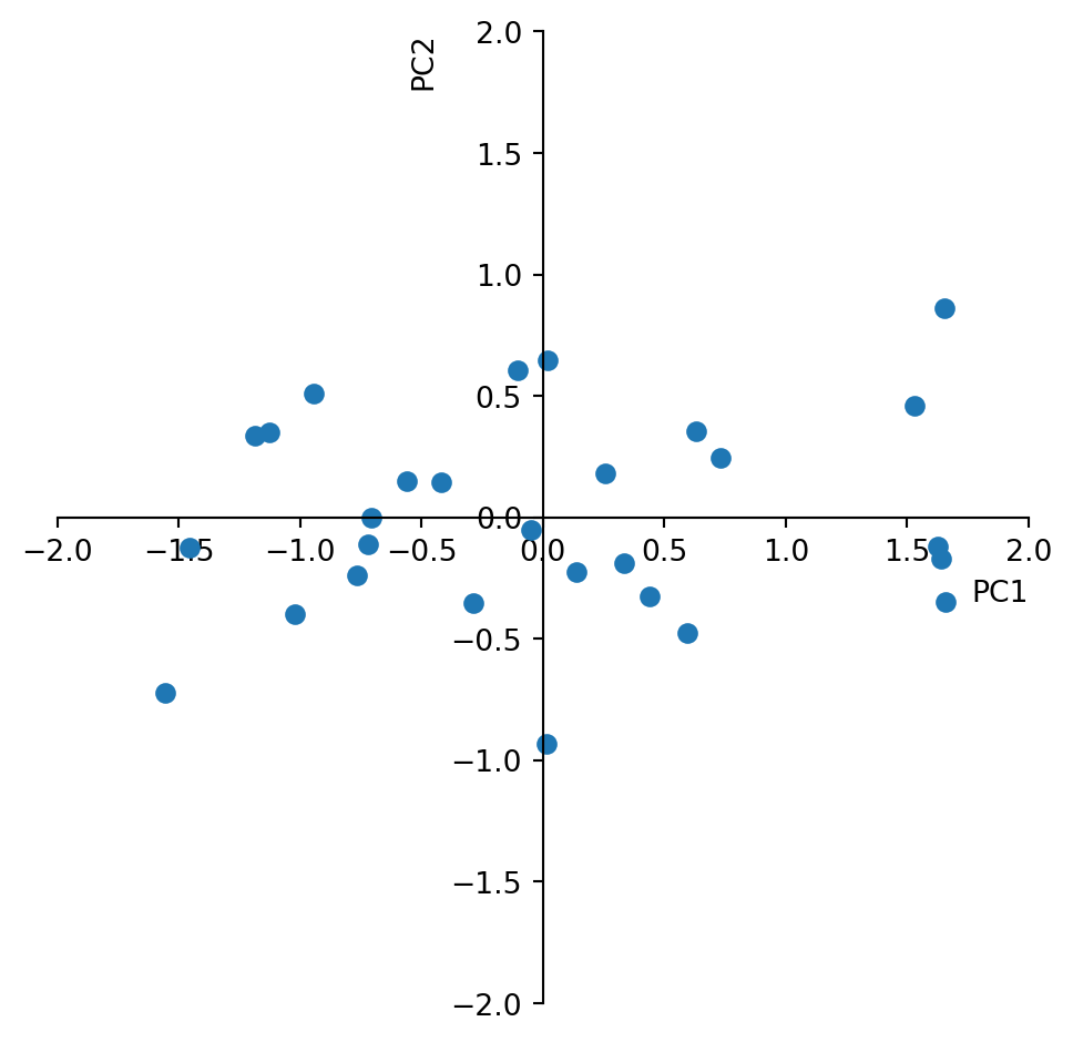
PCA with 3 variables
We will explore a second synthetic example to see the effect of using the correlation matrix and a third variable. Lets assume 30 samples were taken from a sedimentary sequence consisting of minerals derived from three different rock types. We want to know if there are correlations between these variables indicating that there would be shifts between the contribution from the different source rocks. We need to create a synthetic data set consisting of three measurements that represent the amount of each of the three minerals in each of the thirty sediment samples. Also this example is inspired by the textbook “Python Recipes for Earth Sciences” by Martin Trauth (https://doi.org/10.1007/978-3-031-07719-7).
We create the data such that the three variables correlate somewhat with each other.
rng = default_rng(0)
s1 = 8*rng.standard_normal(30)
s2 = 7*rng.standard_normal(30)
s3 = 12*rng.standard_normal(30)

x = np.zeros((30,3))
x[:,0] = 150+ 7*s1+10*s2+2*s3
x[:,1] = 150-8*s1+ 0.1*s2+2*s3
x[:,2] = (250.+5*s1-6*s2+3*s3)/3
Computing histograms you can explore the individual variables.
plt.figure()
plt.subplot(1,3,1)
plt.hist(x[:,0])
plt.subplot(1,3,2)
plt.hist(x[:,1])
plt.subplot(1,3,3)
plt.hist(x[:,2])
plt.show()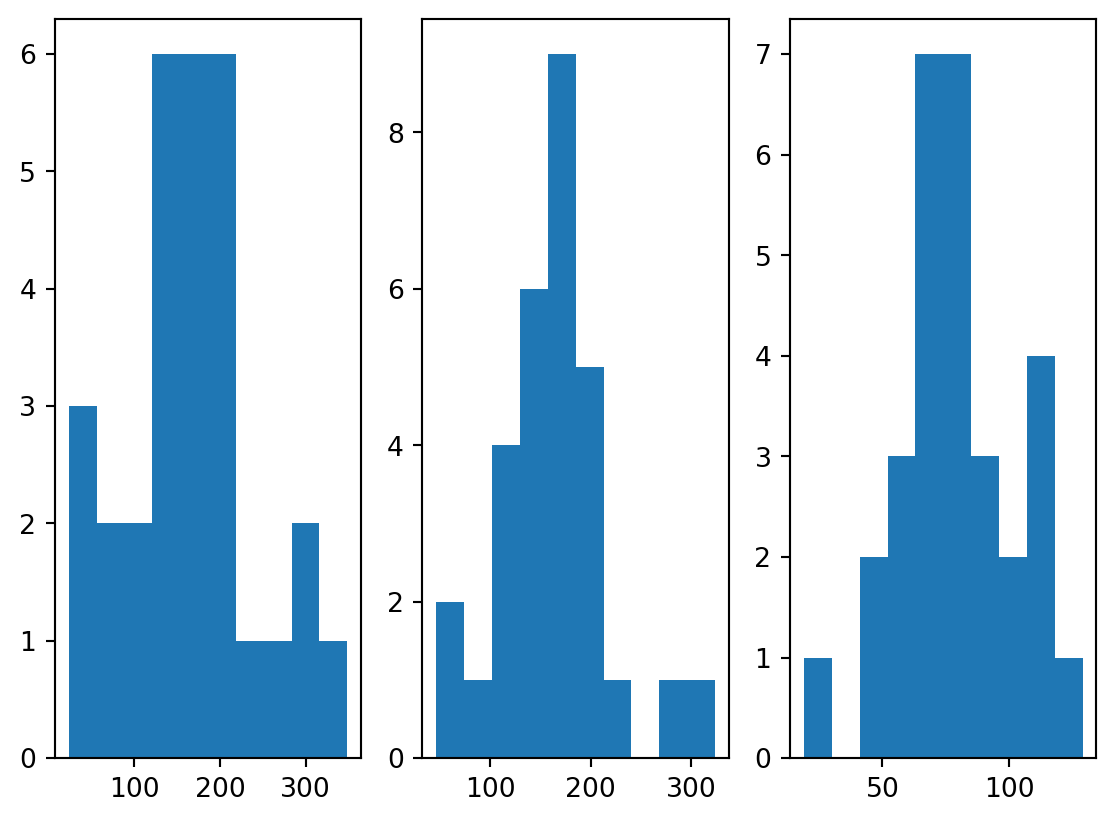
Also looking at the variables along the sedimentary section is informative.
plt.figure()
plt.plot(x)
plt.legend(['Min1','Min2','Min3'])
plt.show()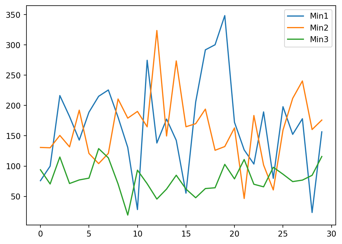
TipQuestion 7
Based on the insights you gained from looking at the data, do you think it should be transformed or standardized prior to PCA analysis?
TipQuestion 8
We created the data such that there is some correlation. Which two variables correlate the most?
We run the PCA for only two components, obtain the loading of the variables and look at them.
pca = PCA(n_components=2)
pca.fit(x)
v_load = pca.components_
print(v_load)
[[ 0.99241597 -0.11944351 0.02904792]
[ 0.1228345 0.97266159 -0.19708148]]
TipQuestion 9
How do we know whether rows or columns are the principal components of the variables?
With this information we can now plot the three variables in with respect to the first two principle components. To the plot we like to add the circle of equilibrium descriptor contribution, which is the square root of the ratio of axis of the plot (we look at 2 axis) and variables of the PCA (we have 3 variables).
import math
a=math.sqrt(2/3)

fig , ax = plt.subplots(1, 1, figsize=(8, 8))
ax.set(ylim=(-1, 1), xlim=(-1, 1))
ax.set_aspect('equal', adjustable='box')
ax.arrow(0, 0, v_load[0,0], v_load[1,0], head_width = 0.02, head_length = 0.05)
ax.text(v_load[0,0],v_load[1,0],'Mineral 1')
ax.arrow(0, 0, v_load[0,1], v_load[1,1], head_width = 0.02, head_length = 0.05)
ax.text(v_load[0,1],v_load[1,1],'Mineral 2')
ax.arrow(0, 0, v_load[0,2], v_load[1,2], head_width = 0.02, head_length = 0.05)
ax.text(v_load[0,2],v_load[1,2],'Mineral 3')
circle1 = plt.Circle((0, 0), a, color='r', fill=False)
ax.add_patch(circle1)
plt.xlabel('First Principal Component')
plt.ylabel('Second Principal Component')
plt.show()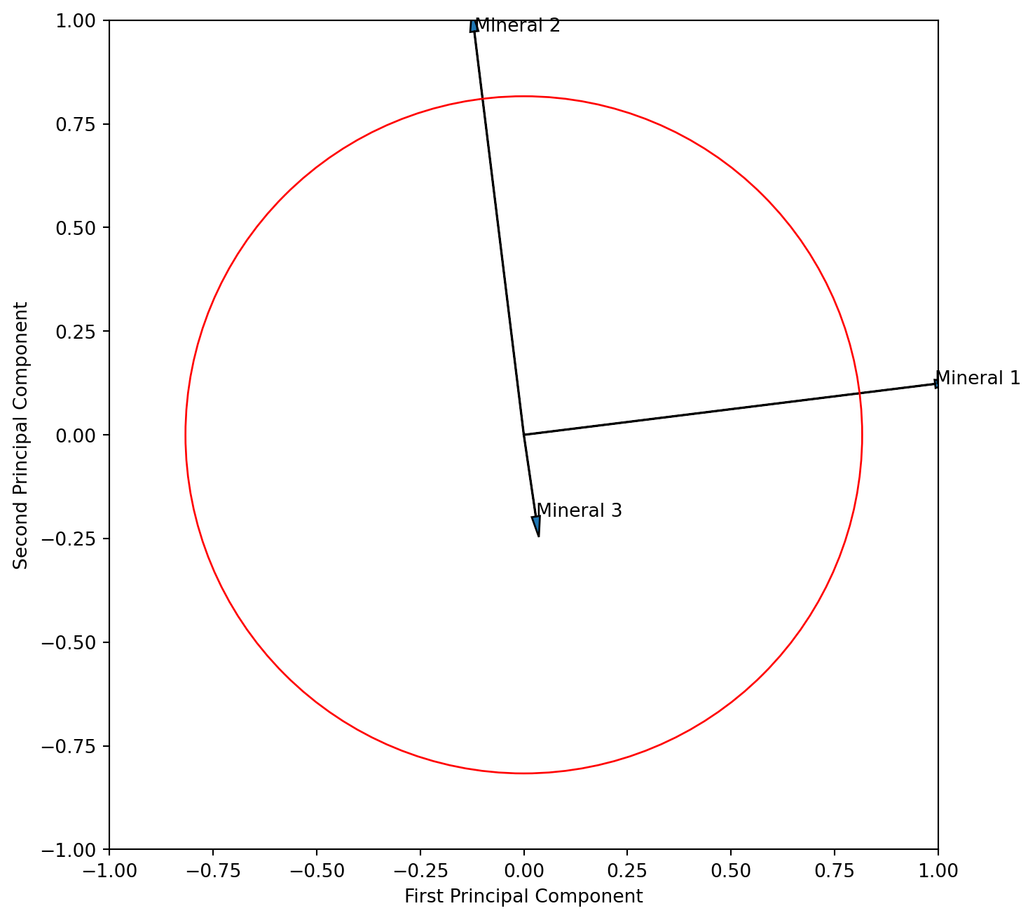
TipQuestion 10
Interpret the resulting figure. What does it tell you about the relationship of the three variables? Is the angle between the vector for mineral 1 and 2 correctly displaying their correlation?
We learned that “scaling 2” adds more information on interpreting the descriptors (variables) thus we will attempt that scaling here. We need to multiply the PC columns of eigenvector matrix with the square root of their eigenvalues. To do that most efficiently we need the full matrix, and therefore rerun the PCA again with all components. We learned that sklearn returns a transposed form of the eigenvector matrix and therefore need to tanspose it here so that the columns are PC’s.
pca = PCA()
pca.fit(x)
v_load = pca.components_

v_load_s = pca.components_.T * np.sqrt(pca.explained_variance_)

fig , ax = plt.subplots(1, 1, figsize=(8, 8))
ax.set(ylim=(-50, 100), xlim=(-50, 100))
ax.set_aspect('equal', adjustable='box')
ax.arrow(0, 0, v_load_s[0,0], v_load_s[0,1], head_width = 2, head_length = 5)
ax.text(v_load_s[0,0],v_load_s[0,1],'Mineral 1')
ax.arrow(0, 0, v_load_s[1,0], v_load_s[1,1], head_width = 2, head_length = 5)
ax.text(v_load_s[1,0],v_load_s[1,1],'Mineral 2')
ax.arrow(0, 0, v_load_s[2,0], v_load_s[2,1], head_width = 2, head_length = 5)
ax.text(v_load_s[2,0],v_load_s[2,1],'Mineral 3')
plt.xlabel('First Principal Component')
plt.ylabel('Second Principal Component')
plt.show()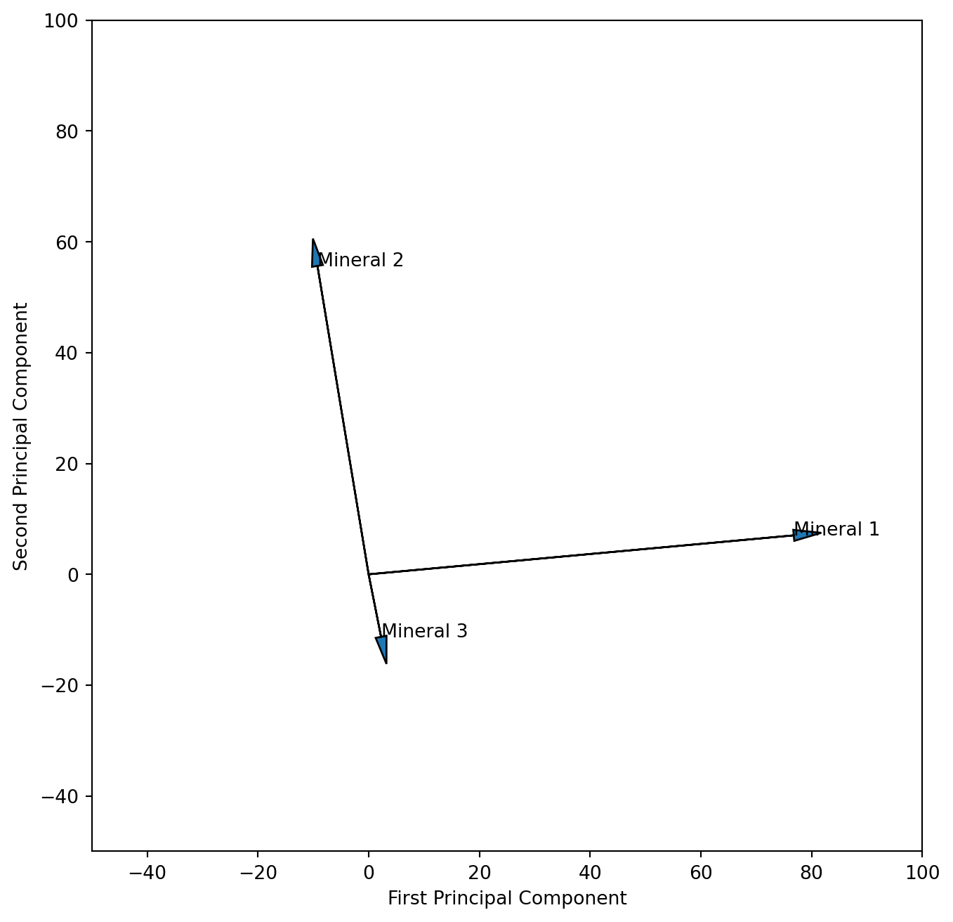
TipQuestion 11
We could argue that our measurements of the different minerals are not on the same scale, which would require standardisation prior to the PCA analysis. Please run the analysis again after standardizing the data. What are the differences in the resulting plots?